MRM By Design: Anchoring a Redesign and Rebrand
4 Min Read By MRM Staff
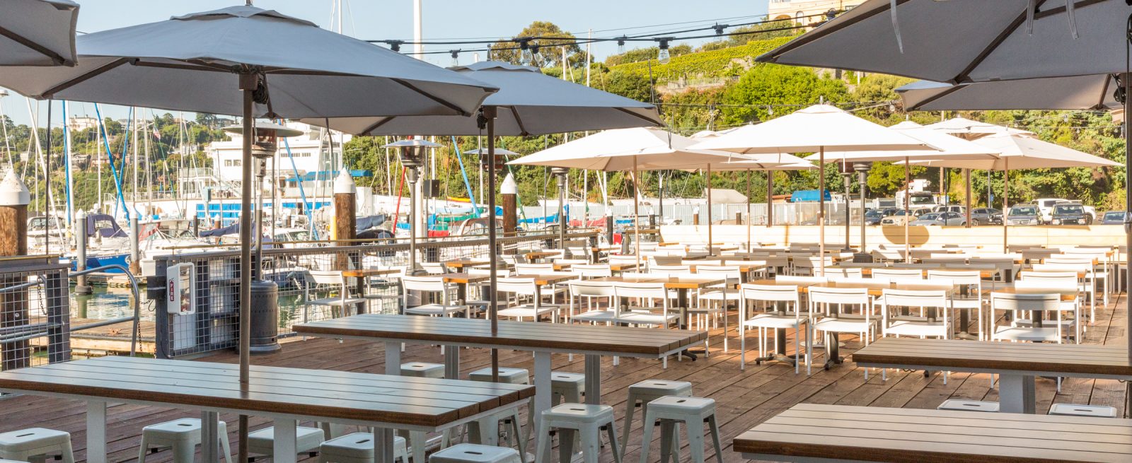
The challenge: Update the nearly 100-year-old Sam’s Anchor Cafe to better help the restaurant compete in the booming Bay Area dining scene, while maintaining its charm, essence and authenticity, top photo by Lauren Edith Andersen. Redesigning and rebranding spaces like a historic restaurant can be a challenge for many designers, but ROY Hospitality Design was ready, beginning with conducting extensive historical research to prep for redesigning the interiors. Keeping older aspects of the site were key to maintaining the authenticity, personality and history Tiburon, California locals loved and wanted to preserve.
In this MRM By Design, Modern Restaurant Management (MRM) magazine delves deeper inside this project with Hannah Collins, Principle Designer & Co-Founder of ROY.
Why did the client’s want a makeover?
Sam’s Anchor Café has been around for 100 years and probably not remodeled cohesively in 50 years or so. There was new ownership and they really wanted to bring Sam's back to life for the community of Tiburon, CA and the greater Bay Area. The restaurant has so much history, and such a strong story to tell. There was a ton of inspiration we were able to pull from.
What was the client hoping to achieve with the redesign?
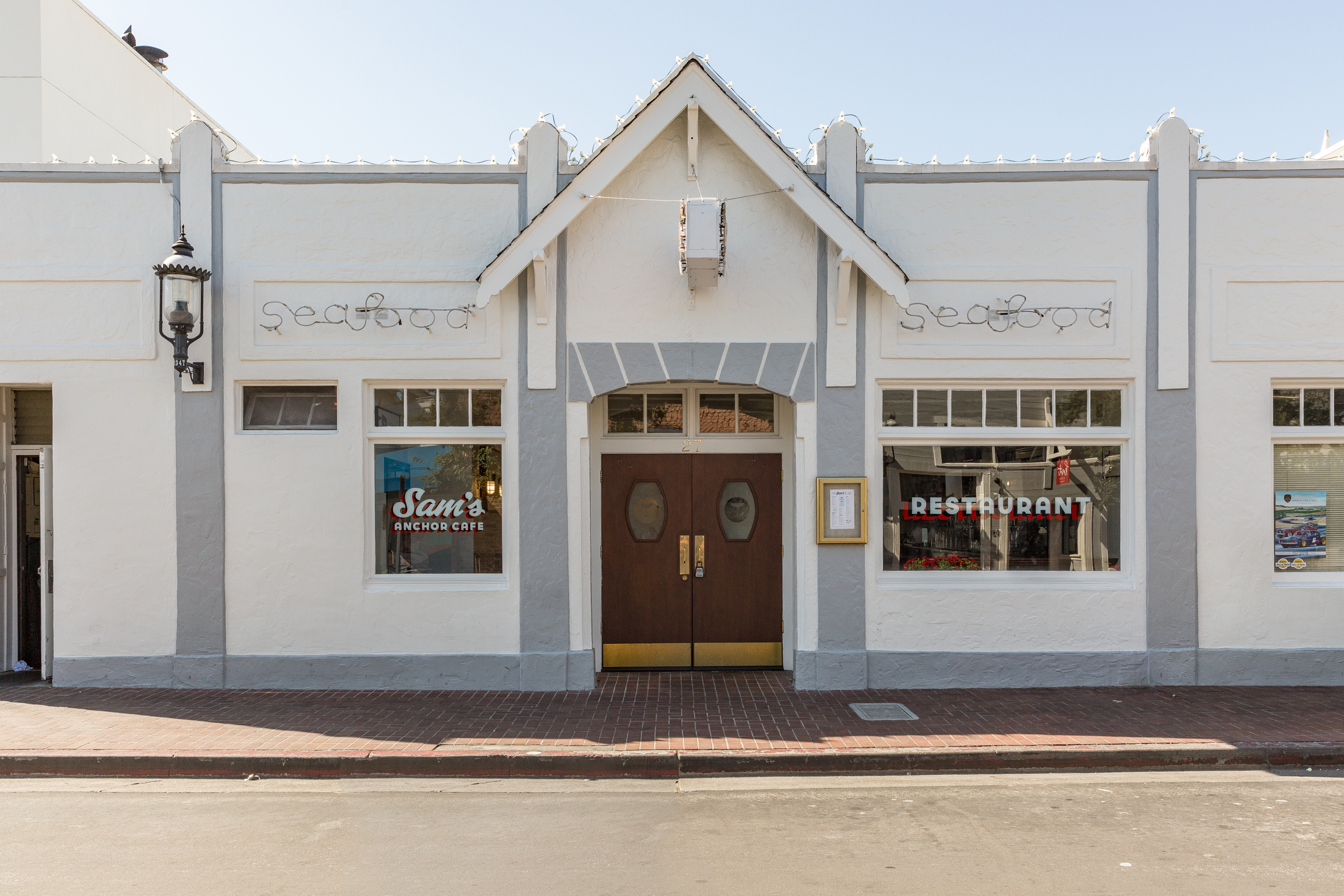
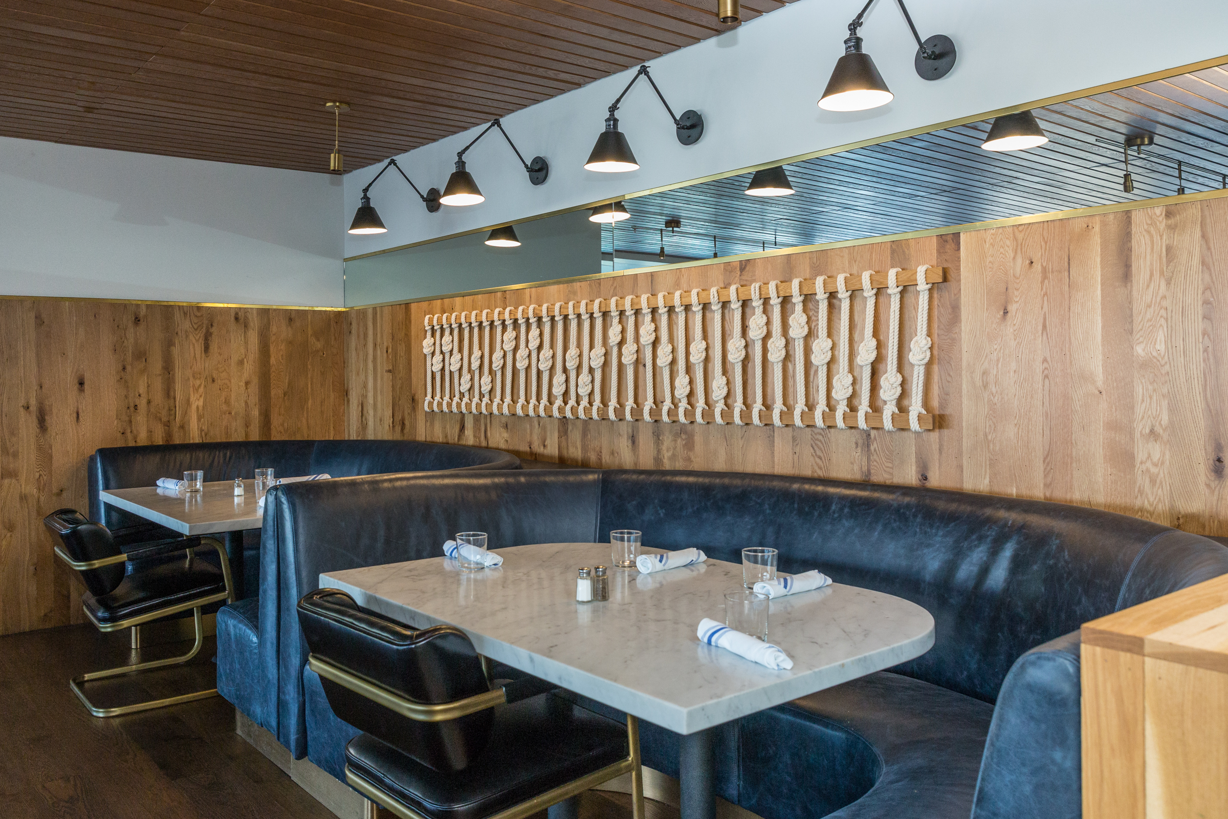
They really wanted to keep the integrity and the feeling you get when being at Sam's. “The most non-exclusive yacht club on the bay” is always how Sam's has been thought about and so we tried to keep that mantra as we made design decisions with the client. There is a strong boating culture in the Bay Area, so each element was thought of as it related to the history of Sam's and how we could thread together the nautical references in a modern, clean and approachable way.
What do you mean by this phrase: There is a history and a ch'i to certain things and removing them can change the space in ways you don't understand?
There is a spirit and an energy to a building, and specifically a restaurant that has been open for 100 years. Hundreds of thousands of people have celebrated, cried, laughed and enjoyed one another at Sam's over the decades. Spaces carry a soul that I think is really important to analyze before you just walk in and start ripping things apart.
Spaces carry a soul that I think is really important to analyze before you just walk in and start ripping things apart.
We spent a lot of time exploring the history of Sam's and the spirit of who the original owner was. We also wanted to be really careful to make sure each element was thought about as it related to the past and the longevity of Sam's for the next 100 years.
How do you approach a project of this scope?
It can be overwhelming at first because it is a large space and has multiple rooms, but we tried to make it all feel a little unique. Typically, we start pulling inspiration images and do a large mind mapping session as a firm (everyone in the firm joins in).
We sit down with tons of imagery and start to put a collection of words up on a wall that we can all see and meditate on. That eventually turns into a mood board, or a series of mood boards, that we share with the client to make sure we are all on the same page and that they love the direction.
From there we start to pull together design language to use throughout the space. Are details chunky, hyper-textural, smooth, round, square, slim, modern, sleek, rustic etc.? Once we have a design language to work off of, the details come much easier.
What were the key challenges of this project?
Anytime you have a project on the water there are issues that come up. You have to use a boat to do some of the construction believe it or not. We also had lots of discoveries come up during demolition that had to be dealt with.
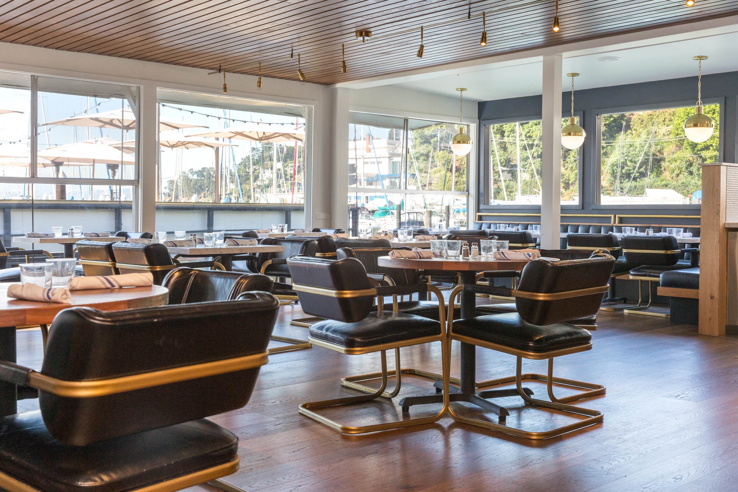
Some were great and some were challenging; for example, when we demolished the ceiling in the boat room, we discovered an old redwood ceiling that we eventually decided to keep instead of adding a drop wood ceiling like we did in the blue room. A remodel, versus new construction, always has this sort of challenge to it because things that come up are a can of worms, especially with a 100 year-old restaurant you really have to decide if you are going to open them or not.
How long was the process?
We were originally approached by the client in May of 2018. We ended up starting design work in July of that year. The remodel started on March 1 and it was completed in six weeks. This was a huge push but the client needed the restaurant back open asap, so we worked tirelessly with the construction crew around the clock for six weeks to get the space back in working condition.
What were your favorite aspects of the project?
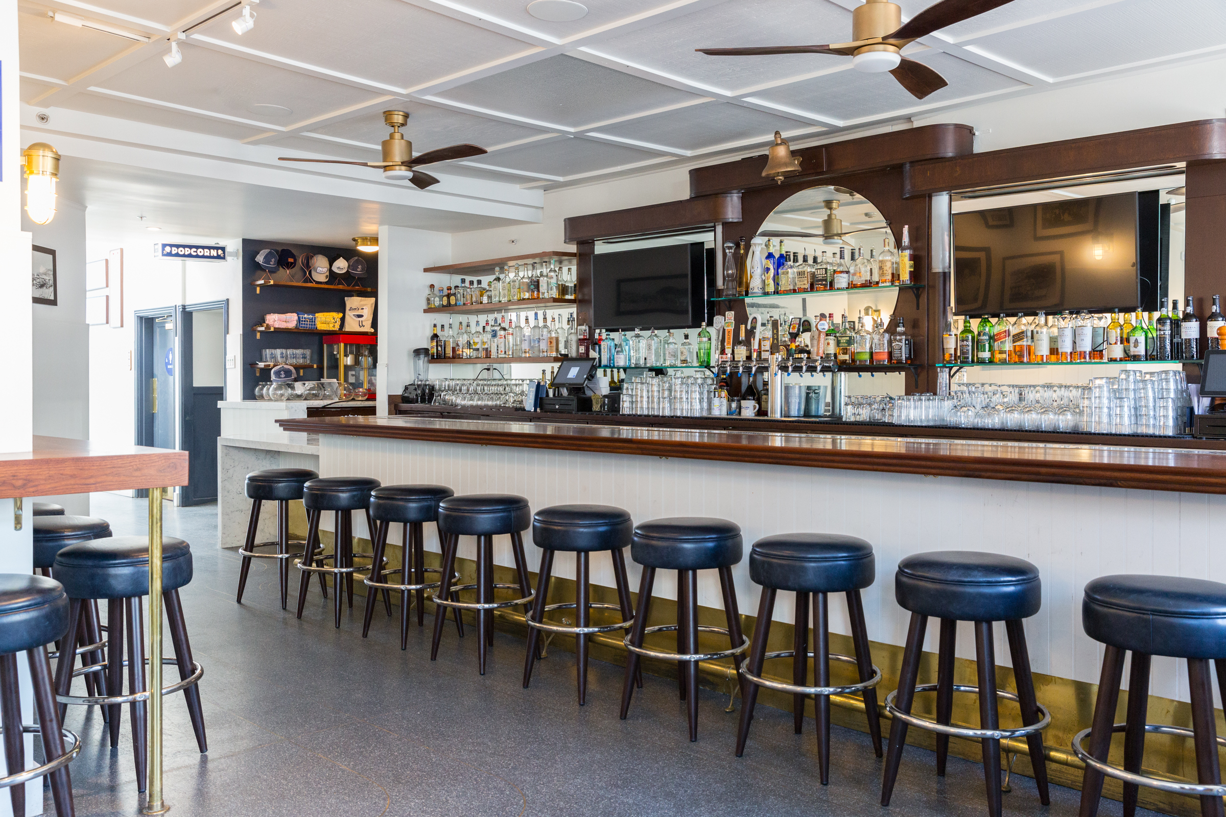
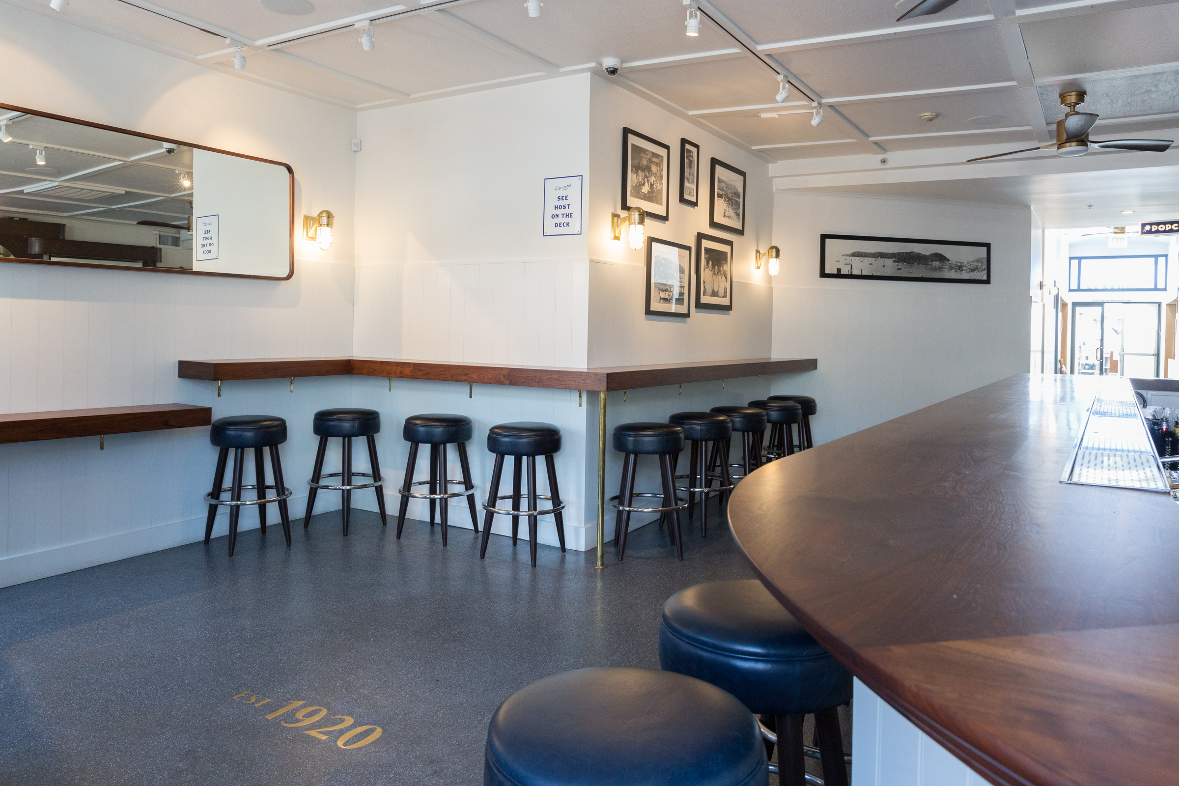
I love working with a project that has that much history and such a strong point of view. It is easy to create a really strong, cohesive design when there is so much inspiration. I love the Terrazzo floors with the brass inlay we were able to include in the design. They just really felt like the right material for the space and they are beautiful.
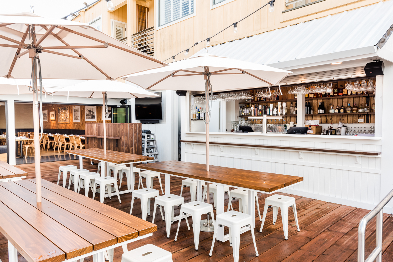
We also worked with Galanter & Jones to add a custom heated outdoor bench to the deck which is a super fun feature and allows for cool nights to still be very much enjoyed.
What response have you received about the redesign?
A lot of regulars and people from Marin have come up to me and said they were so worried their Sam's would be ruined, but that they absolutely love the remodel and feel like it makes so much sense. That makes me feel really great!
Our biggest fear was losing the charm and the soul Sam's has always had, so to hear that we maintained it means a lot. The owners are also really happy with how it turned out which always is extremely important to us. I think it feels just right for Tiburon and for the community who enjoys going to Sam's.

