How to Create a Successful Visual Brand for Your Restaurant in 2020
5 Min Read By Ross Kimbarovsky
Restaurateurs put great passion into their food, their concept, and their decor. But, a restaurant’s brand identity – and visual brand design – is equally important and not to be forgotten.
A restaurant’s brand identity is the cumulative effect of what your guests see, taste, smell, feel and hear at your restaurant, online, and in the world at large.
As we emphasized in our guide on how to start a business, “a strong brand identity is the most effective way your new business can gain a competitive edge in an increasingly crowded marketplace.”
Let’s briefly look at what you need to know to create a successful restaurant brand.
Your Logo
Your logo design is the visual symbol that will represent your restaurant to the world.
A restaurant’s brand identity is the cumulative effect of what your guests see, taste, smell, feel and hear at your restaurant, online, and in the world at large.
Your customers will recognize your business (or not) by your logo. To that end, it’s essential that your logo be easy to recognize. And, to achieve this lofty goal, a logo must be unique, relatively simple, and memorable. But, in today’s crowded marketplace, this is becoming harder and harder to accomplish.
So, don’t rush the logo design process – or, even worse, use a logo generator that spits out generic logos that will fail to deliver a unique visual brand identity. Even if you have a unique business name, a generic logo design will quickly get lost.
Mascots
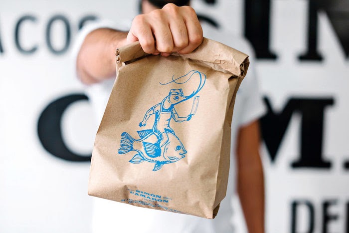
A mascot is not a required branding element by any means. But, mascots are powerful branding tools that restaurants have embraced for years.

If a mascot doesn’t resonate with your restaurant’s brand, then don’t have one. But, if you have a playful style that could be embodied by a mascot character, consider developing a fun mascot figurehead to speak directly to your customers from your social media posts, signage, menu, website, and maybe even merchandise.
Your Website
Your online presence is almost as important as your restaurant itself. You may think that’s overstating, but… According to Restaurant Insider, 90 percent of guests research a restaurant online before dining there. And, of those researchers, 57 percent visit the restaurant’s website.
So, if you have a poorly branded or badly designed website, you stand to turn away 57 percent of your prospective diners. That’s staggering.
Custom-branded website design will communicate to visitors exactly what they can expect when they visit your restaurant. And, for many, your website will deliver your brand’s first impression. So, make sure it’s a good one.
Here are a few guidelines to get you started:
- Feature your brand colors in your website design
- Place your logo prominently so it’s easy to see
- Make it easy to find important things like your menu, location, phone number and hours of operation
- Use similar language on your website that you use in any advertisements
Your Signage
Signage is an important practical element of a restaurant’s visual brand design.
Here are some tips to help you develop an enticing and functional sign to welcome your guests:
- Choose a font that is both brand-appropriate and legible. Ideally, this should be one of your chosen brand fonts
- Feature your brand colors and logo in your sign’s design to help reinforce your visual brand identity
- Choose background and typography colors that stand out for good visibility and legibility from a distance
Your Menu
A unique, on-brand menu is an excellent tool for reinforcing your brand in guests’ minds. And, a smart menu layout will create a pleasant reading experience and can prime diners to want to order more. And, don’t forget your online menus. It’s common practice for people to read restaurant menus online before visiting a restaurant. So, your online menu acts as an advertisement or preview of what they can expect.
Pro Tip: Avoid the recent trend of requiring online visitors to download a PDF in order to see your menu! It’s a hassle and many users just won’t bother – they’ll go to another restaurant instead.
Your Interior Decor
When it comes to visual branding, consistency is key. When guests walk into your restaurant, they want the reassurance of seeing a space that’s consistent with the brand they’ve seen so far. If they find a space that doesn’t meet those expectations, they will feel mislead.
That’s not a good first impression. And first impressions can be hard to overcome.
Here are some guidelines you can follow to create a positive and cohesively branded interior design:
Color Palette
Your brand colors should feature prominently in your decor. But, don’t be afraid to supplement your brand colors with some neutral shades to create visual balance in your restaurant.
Using neutral colors like black, white, grey, beige or taupe; or neutral textures like natural woods, stone or fabricated metals generously can help to offset more vibrant shades. This leads to a more open and relaxing feeling in your space.
Atmosphere
To get the atmosphere right choose furniture that reflects your brand’s personality. Is your brand quirky and casual? Then choose playful furniture to reflect that. Is your restaurant earthy and organic? Serve up furniture made from sustainable materials along with your seasonal fare.

Think about the impact you can make with lighting fixtures. The design of the fixtures – as well as the quality of light they spread – can create many different moods. What mood is best for your brand?
When deciding what to include in your restaurant decor, no decision should be arbitrary. Make selections that will communicate your brand essence and deliver the kind of experience that will make your restaurant memorable and worth sharing.
Your Staff Uniforms
Your staff is the living embodiment of your brand. They must walk and talk about your brand values and personality. And, they must also look the part. Staff uniforms don’t need to be complicated. Not every restaurant brand requires 15 pieces of flair. But, it is important to think about your brand and make uniform choices that support your brand personality.

Here are some options for you to consider:
- Ask staff to wear neutral pants and a polo, tee, or button-down in one of your brand colors
- Provide servers with custom t-shirts featuring your logo and perhaps a tagline
- Incorporate themed garments like Hawaiian shirts, poodle skirts, or cowboy boots, if appropriate
- Opt for all black for a simple and elegant attire solution
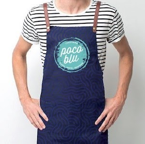
- Provide a uniform apron to be worn over neutral clothing of the server’s choosing
Consistency
The key to modern restaurant branding is consistency. Your guests want a reliable experience that they can trust – and consistent visual branding is reassuring.
If you want customers to remember you and keep coming back, develop a consistent and cohesive visual brand everywhere your customers look.
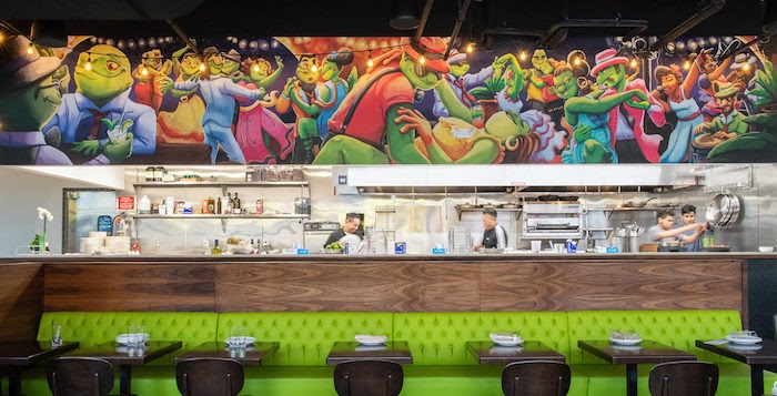
Top photo: El Sapo Bar – Image courtesy of Grits and Grids
For more tips and advice on creating a successful restaurant brand, read The Definitive Guide To Creating a Compelling Visual Brand for Your Restaurant in 2020.


