How to Create a Consistent Aesthetic For Your Restaurant’s Instagram Profile
3 Min Read By Natasha Ponomaroff
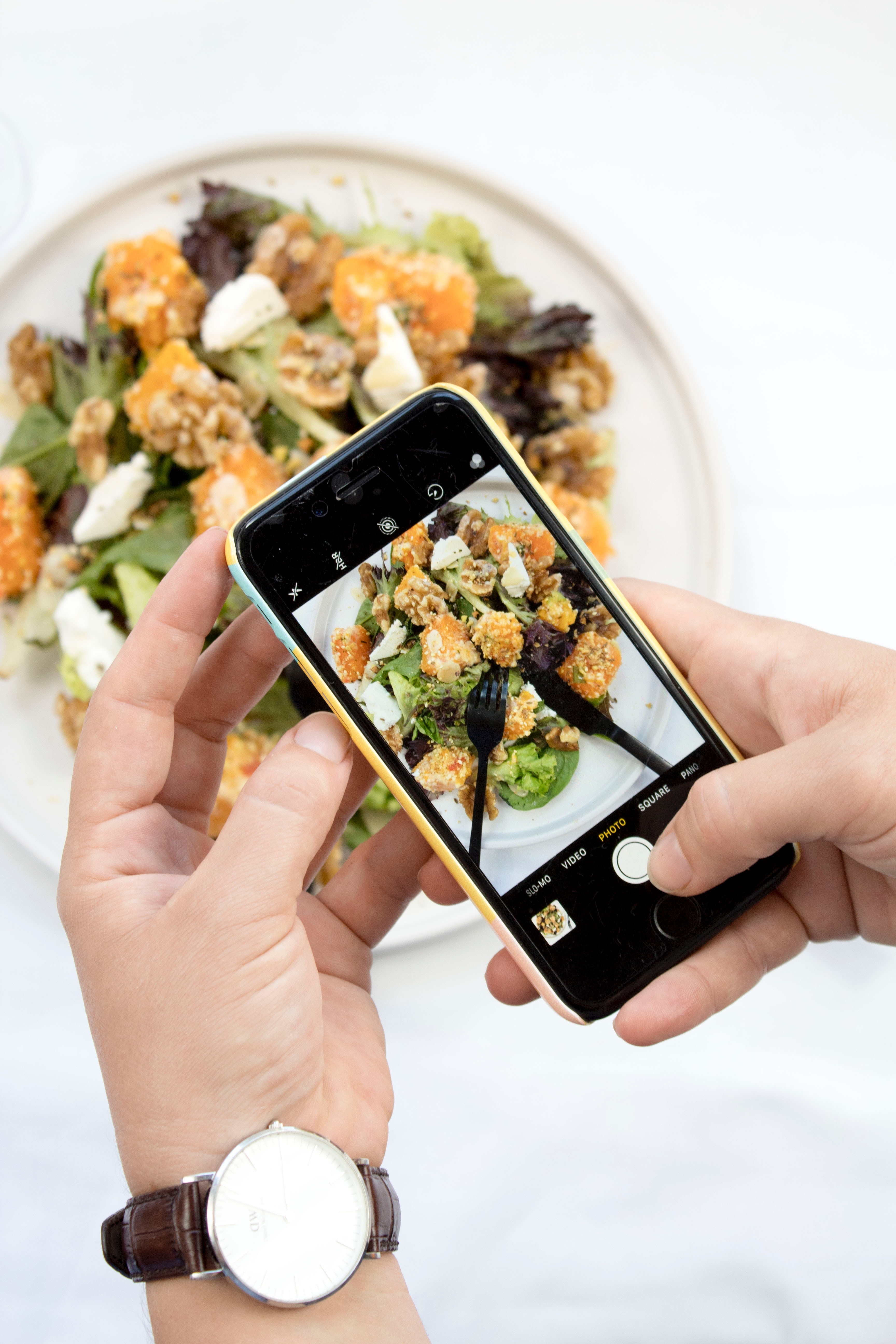
Online menus and food orders, designer restaurant websites and endless #yum posts on Instagram make something pretty obvious: people love looking at and sharing pictures of food. The desire to snap a shot of a delicious plate and share it with others has turned loyal patrons into social media marketers. Instagram, for example, has 130 million active users per month and more than 45 million photo uploads per day.
An Instagram account with high-quality, consistent images of your restaurant not only allows you to share images of perfect dishes, it also creates a space to interact with customers before and after they leave.
An Instagram account with high-quality, consistent images of your restaurant not only allows you to share images of perfect dishes, it also creates a space to interact with customers before and after they leave. So, let’s make sure that your restaurant’s Instagram account doesn’t look like old-school scrapbooking. Keeping your restaurant aesthetic, also known as your brand, consistent is the key. Creating and maintaining your restaurant’s ‘visual voice’ is simple, here’s some help getting started.
Grids Are Your Foundation
A grid layout organizes the images in your feed into a square framework and helps you choose which photo to put next to another photo. A grid layout makes it easy to begin and retain a consistent Instagram theme. There is more than one type of Instagram grid layout to choose from. Some of the eleven of the most instagrammable restaurants in New York City use a grid to plan their content. The grid allows them to combine tempting shots of their cuisine, pics of loyal patrons and elegant, atmospheric photos of their space. They’ve achieved an aesthetically enticing Instagram feed worthy of an IRL visit, and you can too.

Create Your Theme
A theme is your vibe, your mood, your restaurant’s ‘soul’. A theme makes your images and videos look like one carefully curated collection instead of a jumble of disconnected moments. Choosing a compelling theme that visually communicates your restaurant’s attributes is a great way to get recognized and maintain consistency.

So, what do you want your theme to be? White background, Dark & Moody, Make the Buzz, Color Coordination, Row by Row…? A white background is great because it’s neutral and allows you post photos of pretty much anything without clashing or creating a distraction. But, maybe you want something different. Try a mysterious filter for your restaurant account and stand out a little. K. Schikkina, whose popular Instagram account @schikkina uses consistent dark colors to make her feed memorably moody.
Keep it Simple and Professional: Edit and Filter
A theme is nothing without a filter. Using the same filter on your photos, all of the time is the easiest way to maintain your theme and create ‘brand’ recognition. Photo editing apps, which allow you to correct and perfect the technical aspects of your shots including composition and exposure, also have great filters to choose from. There are many filters suitable for food; it’s best to pick one filter and stick to it. Remember to pay attention to lighting, angles, and the overall content of your feed.

Balance Is the Key
After you’ve edited your photos, think about how they’ll look next to each other, as a whole feed. Think about the ‘balance’ of your placement, which means making sure that it’s not too ‘busy’ or cluttered. You want new eyes (customers) to move throughout your feed without interruption while seeing the details of your photos (food) easily.

The goal here is to create a depth of field, by placing more ‘busy’ photos next to clean or minimal photos. If you’re a business (a restaurant) selling products (food) via Instagram you can do this by mixing up pics of food with some user-generated content, behind the scenes photos or any other different types of content you plan to post. If you have a hard time visualizing how your pics will look in advance, you can get an app that allows you to preview your feed.
A Consistent Story Always Wins
Maintaining your aesthetic, your theme doesn’t end with your feed.
You also want to make sure you’re thinking about your Instagram stories. Creating cohesive Instagram Stories is a great way to build your brand and keep your customers coming back for more. This can be as simple as using the same Instagram font, or using the design and style of your website (logo, color palette, and tone) and applying it to your Instagram story.

Maintaining a consistent image feed is key to growing your business’s followers, getting customers to place an order and ultimately, visit your restaurant.


