Honoring the Legacy of a Historic Structure
4 Min Read
Seattle-based Floisand Studio Architects has had a long-term partnership with Pagliacci Pizza including the thoughtful reimagination of the chain's newest location across from Seattle’s Ballard Locks.
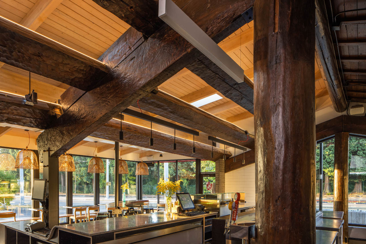
The original design is a heavy timber replica of a six-beam Haida house—a traditional style of building by the Haida Tribe—which opened in 1939 as a Native American curio shop before serving as a restaurant space starting in 1945. Working with Headwater People to better understand the building and its history, the architects carefully preserved the structure’s original logs, and carvings made by Northwest Coast artist Jimmy John. New landscaping incorporates native edible plants which are identified by custom signage showing the phonetic spelling in both the native Whulshootseed and English languages.
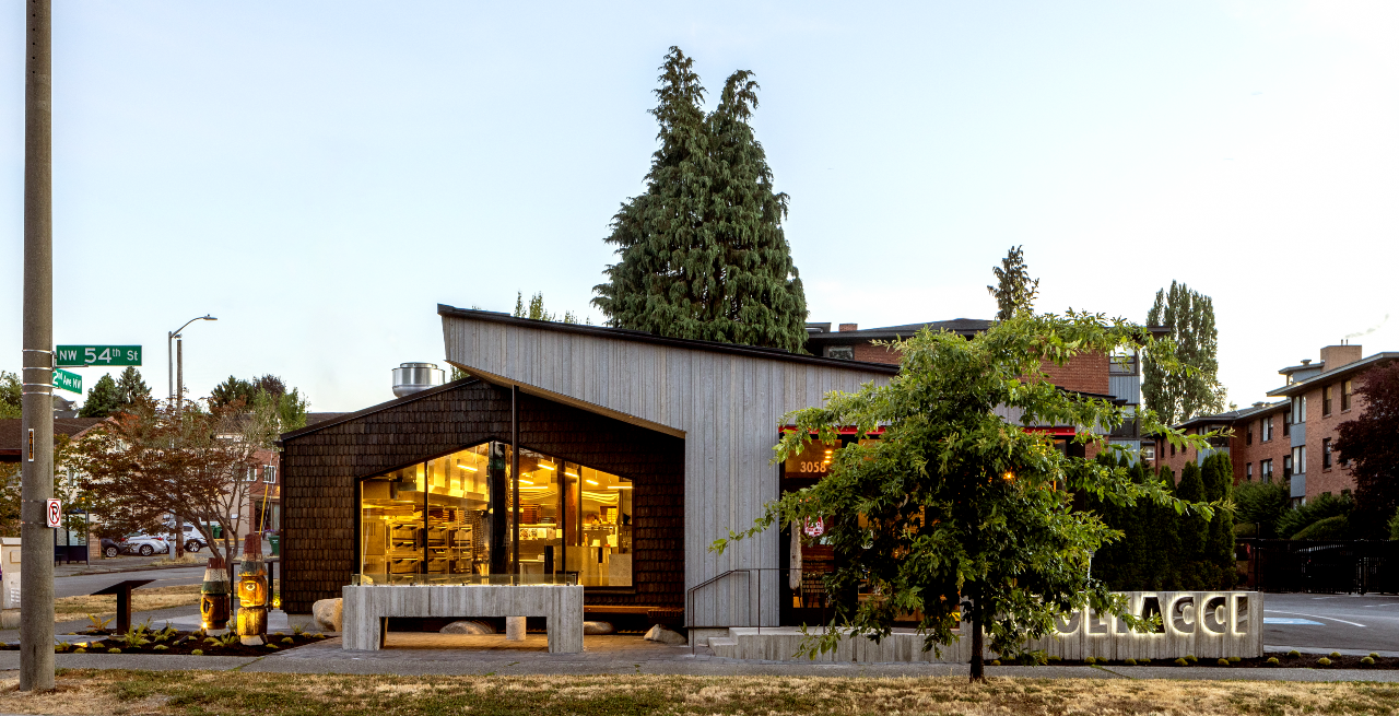
The building’s new timber addition adds 1,300 square feet of much-needed space to the program. Using a wrap-around approach to engage the existing building, the addition complements the old structure by following the lines of the original Haida house form. The architects removed rotting elements, using the new building to wrap over half of the old. In the overlapping area, the roof is peeled back to create a double-height space and highlight the original beams. The exterior was clad with cedar siding and shingles as a nod to the sawmills and boatbuilding industries that developed along the neighborhood’s shores and earned Ballard the nickname, Shingle Town USA.
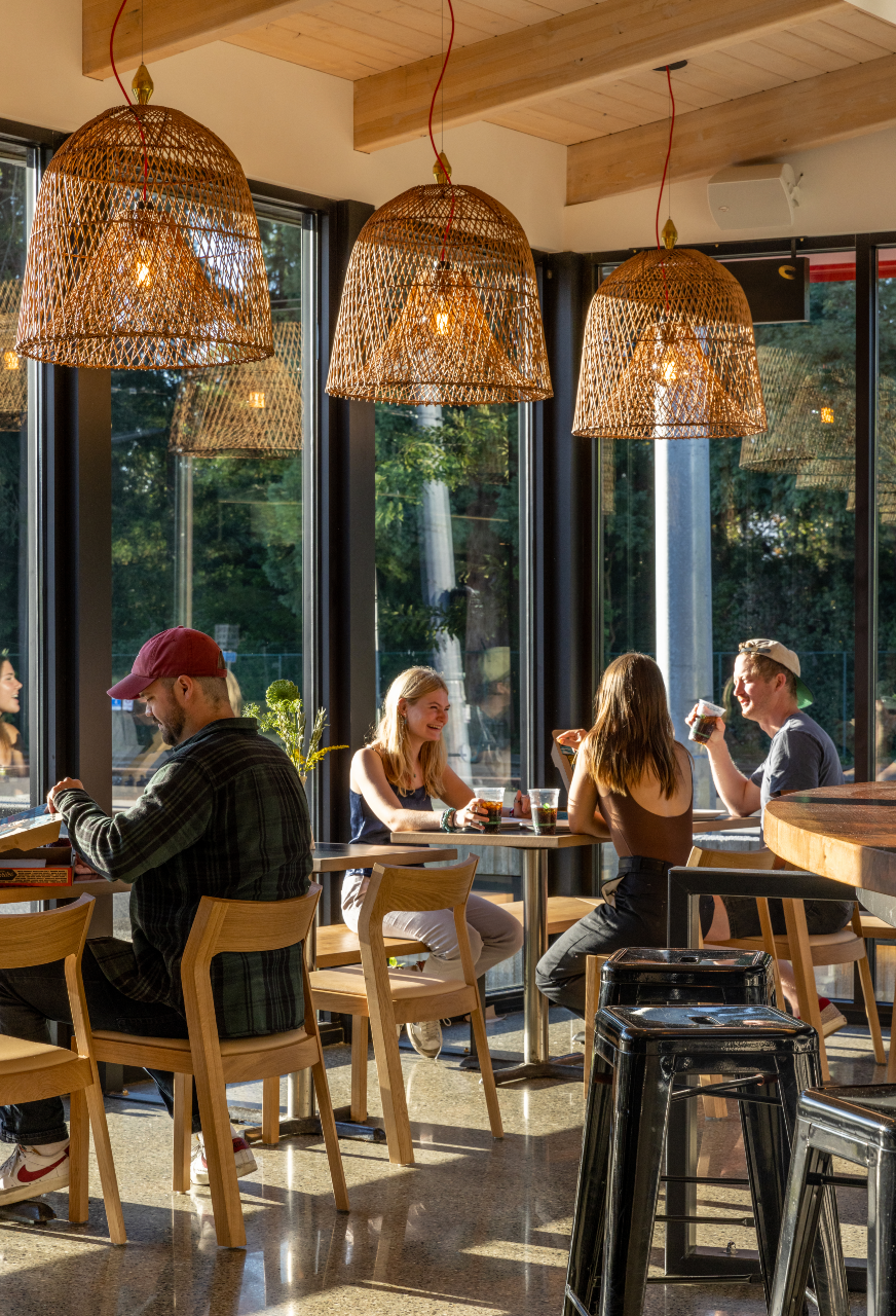
Inside, the architects designed custom built-in furniture and selected finishes that showcase artisan craftsmanship. The team thoughtfully sourced woven window lights to honor the rich tradition of weaving found in local Native American culture.
Modern Restaurant Management (MRM) magazine learned more about the project from Richard Floisand, co-founder, aia, leed ap and Allison Hogue, co-founder, aia, ncarb.
How many projects have you collaborated on with Pagliacci Pizza? And why do you feel they keep wanting to work with your team on projects?
We have worked on all 25 locations—two new builds and the rest a mix of large and small remodels and additions. Matt Galvin, a Pagliacci owner, says one of the reasons he likes working with us is our willingness to jump in and contribute to any task. I like to joke about the number of mop sinks I’ve designed over the years.
By virtue of our longstanding collaboration, we’ve gotten involved in many aspects of Pagliacci’s business. We collaborate on aligning their brand with the architecture and ensuring that each restaurant represents the company identity and fits the character of its neighborhood. A consistent goal of ours is to reveal the inherent beauty and logic of building materials and the craft of putting them together. Along with site-specific design, I like to think these principles align with Pagliacci’s values, and the thought, quality, and care that they put into creating and sharing their artisan pizza.

What is the process like and what aesthetics do you hope to achieve?
Part of the fun of working with Pagliacci is that each restaurant is different. No two are alike. Our client is always open to exploring new ideas and ways of thinking about the restaurant experience.
That said, maximizing restaurant operations and efficiency is an important part of our work. Over the years, we’ve honed our collective design approach by testing and fine-tuning layout and operational requirements, equipment adjacencies and clearances, and the types of seating that work best for each location. As a carry-out/dine-in/delivery restaurant, every fraction of every square inch of the POS, kitchen, and back of house has to be carefully planned, especially since many of the buildouts occur in existing buildings. Our work often involves adapting Pagliacci's program into spaces that were not built for that purpose. It's a fun puzzle with a lot to factor in: changing equipment and technologies, workflow optimization, sanitation, ventilation, sustainability, artificial and daylighting, and of course, the customer and employee experience.
The designs we explore for each store are varied with a few common themes. We gravitate towards a clean exterior palette, floor-to-ceiling windows that bring in light and create street visibility, and wood, metal, and brick siding. To address environmental concerns—moisture in the winter and solar heat gain in the summer—we integrate brise soleil, rain canopies, and trellis features into our exteriors. These elements not only mitigate environmental concerns but create an opportunity for interesting design moments.
At the end of the day, we want Pagliacci’s patrons to be intrigued by what they see. We want the inherent richness of the materials and the craft it takes to put them together to read clearly. This is what ties our work with artisan pizza making: a focus on how the finer details reinforce Pagliacci’s commitment to making great, locally sourced pizza.
What was the process for this particular project?
First, we looked at the existing building during the feasibility study to determine if the program would fit into the building and the site. Next, we worked with local consultants to understand Native American cultural considerations and historic preservation requirements, and conducted a study of Ballard’s historic building types. Finally, our team came up with multiple options to address our findings and all of Pagliacci’s programmatic needs while providing an exciting place to dine.

Why was it so important to create a thoughtful design that is respectful of the area’s history?
Designing specific to a neighborhood makes the space personal to its patrons. It also provides a fascinating opportunity to study the history of the area and provides great inspiration for the design.
What were key challenges encountered during the project?
Working the program around the existing log poles was a challenge. Since they held up the old roof structure and could not be removed, there were only a few ways to lay out the ovens and make lines within the poles.
How do you find cohesion across the brand in the locations?
Each store is different because we design them for the unique neighborhood in which they sit. However, there are common threads. During the feasibility portion of a new project, we’re often looking at older buildings. We analyze the weakness and strengths of what is there and take those strengths into the building’s new life. This could be something like peeling back surfaces to expose brick or old timbers, or placing new skylights and windows in the existing structure. Our designs tend to celebrate craft and materiality. Just like making a good Hawaiian pizza, it is a balance of the right amount of pineapple.

