F&B Headquarter ABCs
4 Min Read By Lori Bongiorno and Carrie Boyd
You are no longer just looking at work stations and offices, you have to think about living, flexible environments.
For architectural professionals, designing a company’s new headquarters or corporate campus is a unique challenge. On top of the usual design decisions and functionality considerations, a company’s headquarters is increasingly seen as a kind of symbol: a brick-and-mortar representation of a business’s brand and even its values.
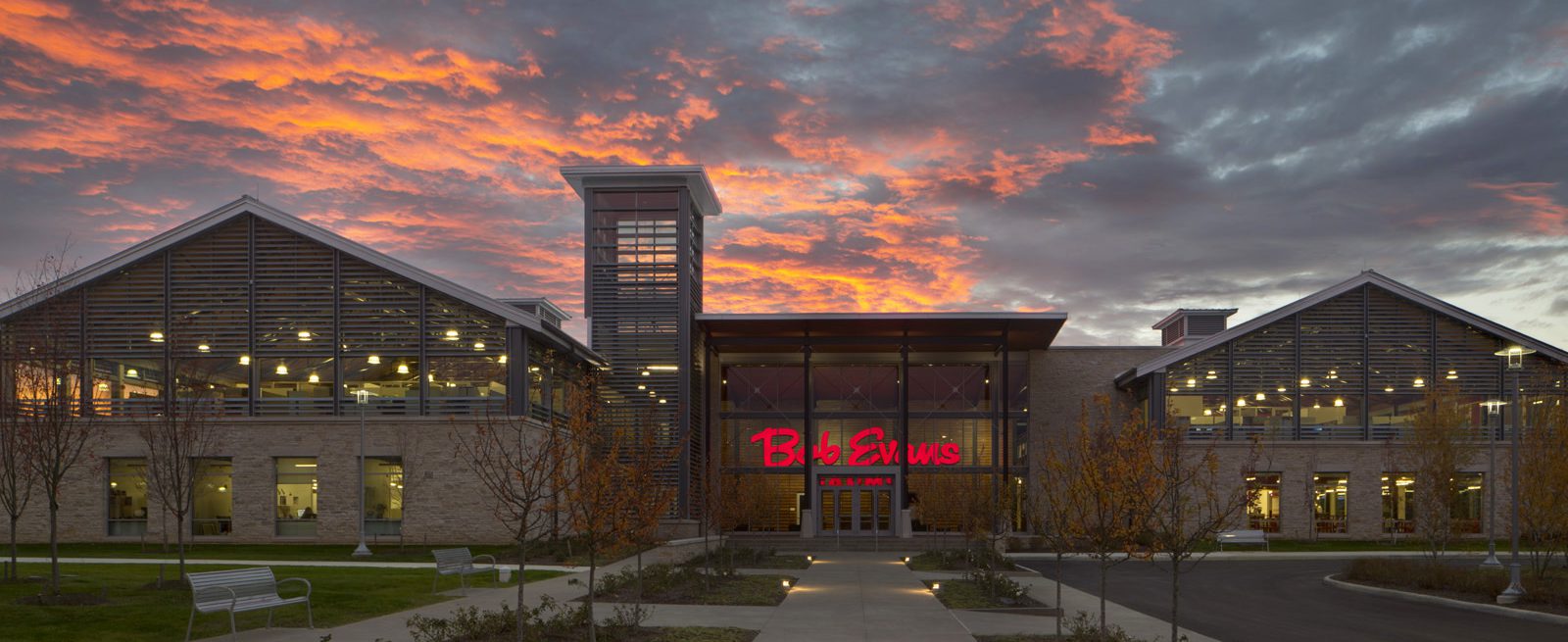
That push seems to be particularly prevalent for F&B clients, who often have the added complication of a test kitchen or laboratory facility on site. Bob Evans’ corporate campus in New Albany, Ohio, is an excellent representative example. The $32 million, 165,000-square-foot project features a test and training kitchen, a company history museum, and training facilities in addition to corporate offices. A closer look behind the scenes of the creative process that went into this project can help provide a deeper understanding of how the design process works, make it easier to appreciate the priorities and preferences of F&B clients, and provide a better sense of how to navigate—and ultimately overcome—the unique challenges associated with creating an F&B headquarters or corporate campus.
Brand Integration
Brand integration is hugely important, and seems to be becoming a bigger deal in recent years. A design that connects the space with the brand identity helps reinforce internal character and values to existing employees, and can even help boost recruiting and strengthen client relationships. Bob Evans wanted their new headquarters to reflect who they are as an organization, with a consistent emphasis on “food, founders and farming.” The campus was referred to as “Farm North,” paying homage to “Farm South,” the original Bob Evans farm in Rio Grande, Ohio.
 The main building was designed with architectural cues that evoked a subtle barn motif, with twin sunrise and sunset towers flanking the building as a nod to the beginning and end of a farmer’s day. The project was designed in part by applying a farmer’s sensibility to every decision. Authenticity and simplicity were key themes, reinforced by the real wood and stone materials used throughout. The result is a facility that represents something Steve Davis, the former Chairman and CEO of Bob Evans Farms, calls an “interactive, educational farm experience.”
Cafés and Community
For many F&B companies, having a social/community café space where they are able to showcase their food is a priority. Bob Evans’ headquarters featured a Bob Evans Express—a concept the company was in the process of rolling out in airports, hospitals, universities, and other corporate locations.
Another category of unique collaborative/community space that is becoming more popular is small marketing hubs designed for information sharing: spaces where different departments can come together to showcase new products and innovations that they are working on.
Kitchen Not-So-Confidential
The literal and figurative center of the Bob Evans building is the R&D test kitchen—a space that is also the cultural heart of the company. Having that front-and-center, where clients and professional partners can see into the kitchen while entering the space, was a priority for Bob Evans, as it is for other F&B brands. The trick is to establish clear sight-lines into that space (with visibility that builds excitement and interest by giving visitors a window into that work) while still providing space where proprietary work can be conducted privately and securely.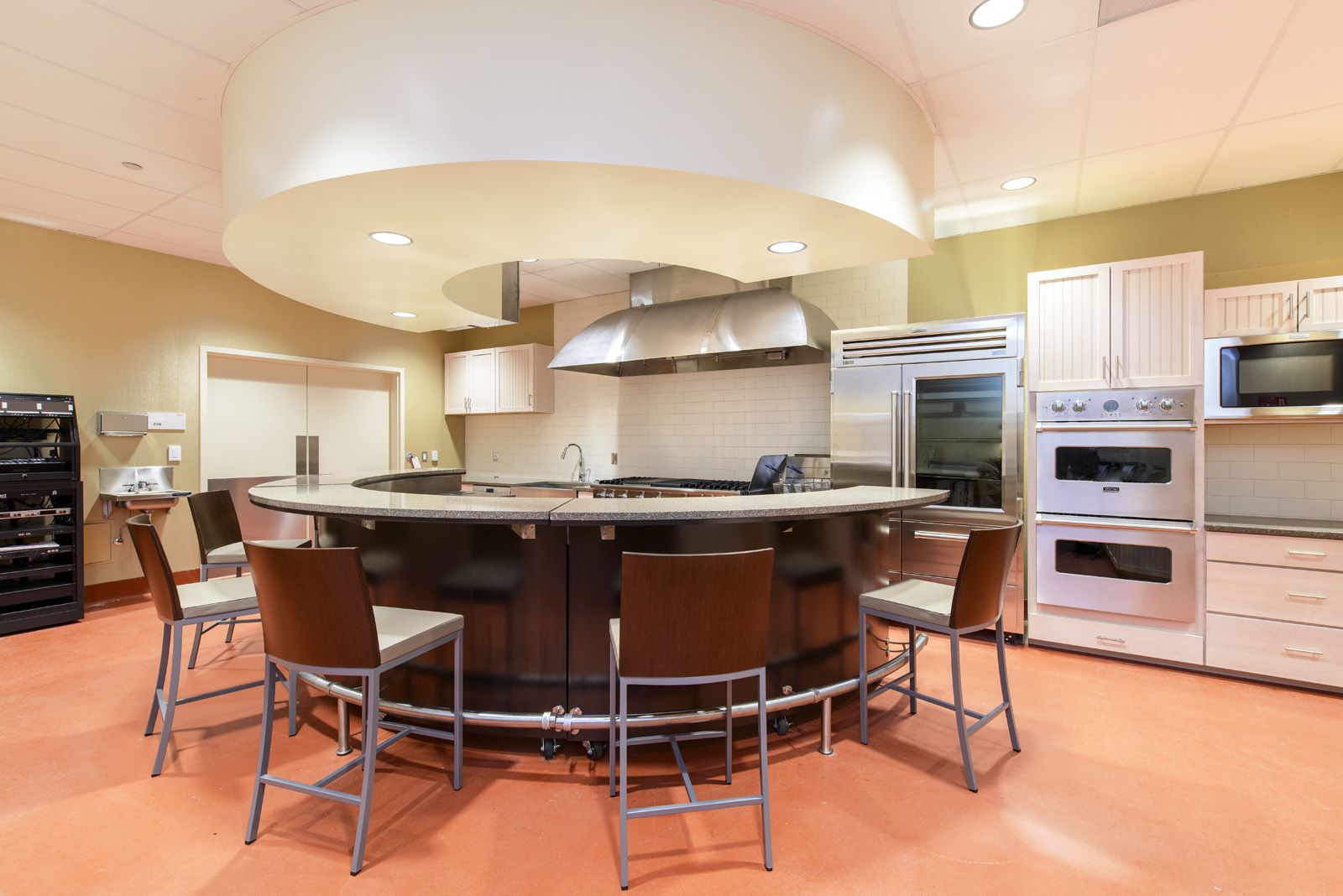
It can be a real challenge integrating a 15,000-square-foot kitchen into a facility that also needs to function and flow like a typical office building. In addition to technical issues like ventilation, grease traps and deliveries—which all require very different infrastructure support than an office building—Bob Evans’ test kitchen had to be prominently featured in a way that doesn’t compromise natural light and building functionality. Another balancing act is to highlight the test kitchen as a highly visible feature, while still making the space fit seamlessly in with the rest of the building.
The Living Office
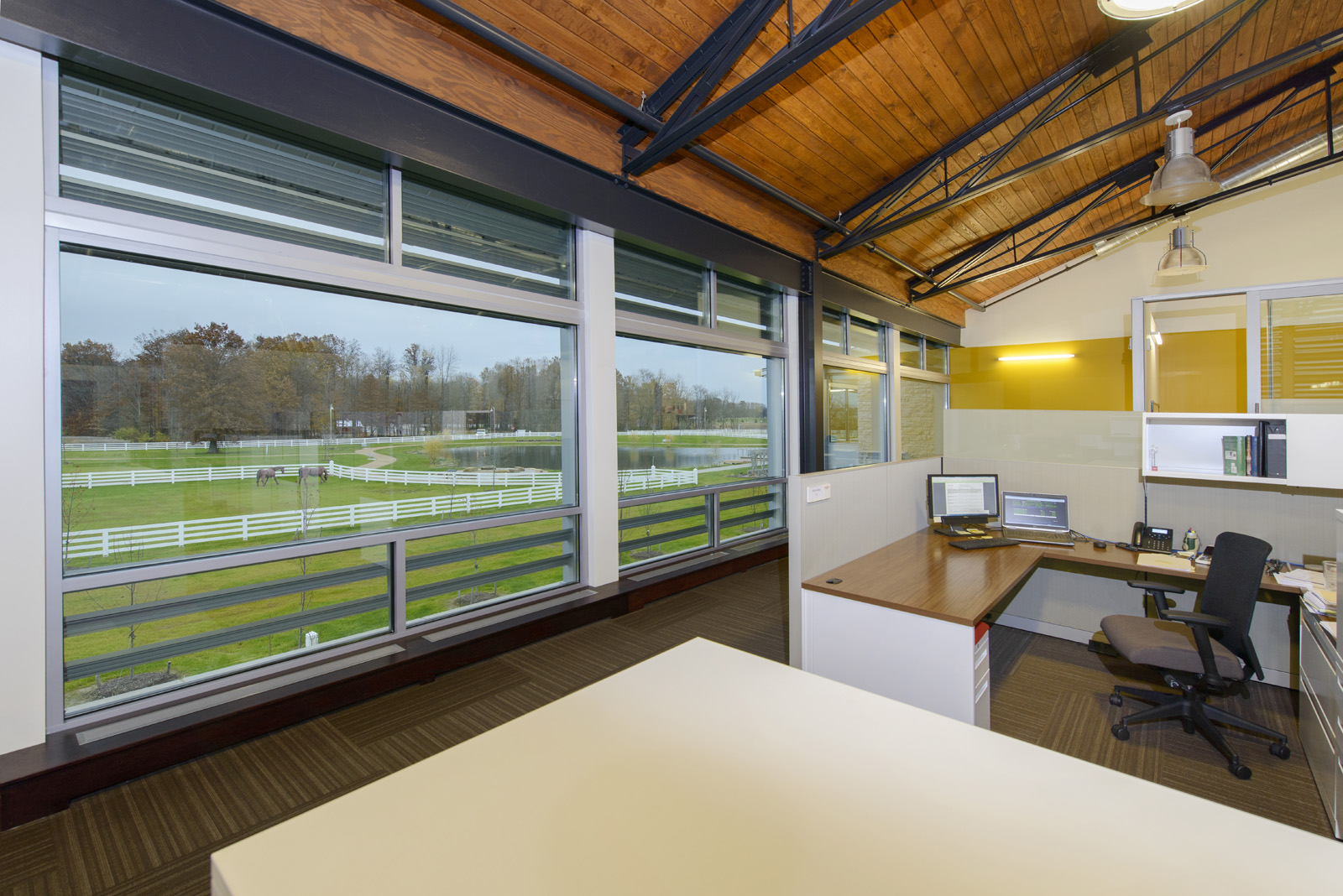
Bob Evans’ new campus also embraced another popular trend: a design that functions as a kind of “living office,” with a blend of flexible public and private spaces where staffers can decide daily where and how they want to work. This requires a very specific architectural design and planning approach. You are no longer just looking at work stations and offices, you have to think about living, flexible environments. That raises new design questions that must be answered: if meetings will be held in public spaces, what needs to be done to accommodate that? What kind of technology and IT integration will allow these spaces to become the flexible and collaborative resources they need to be?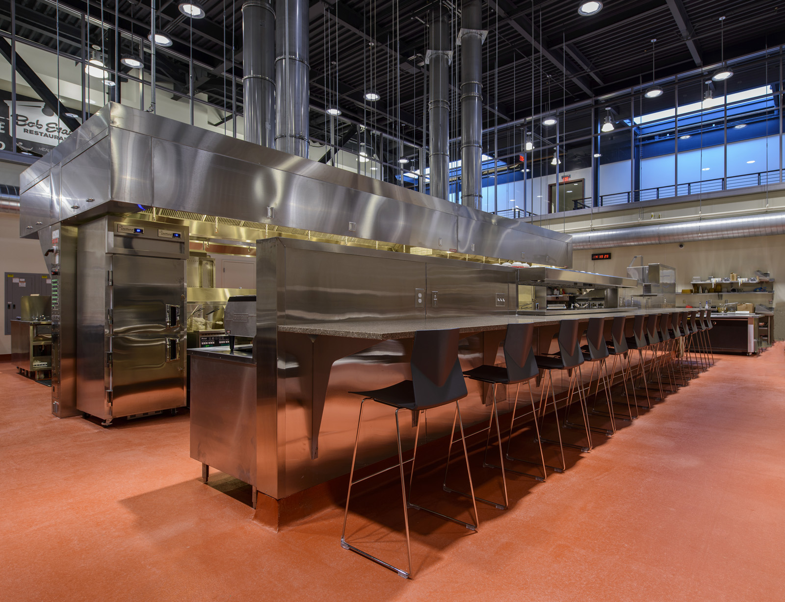
Bob Evans, like many F&B businesses, is constantly innovating and creating new menu items. Attracting young talent is therefore a priority, and having a space that is high tech, well lit, open, and visually and experientially dynamic is actually a powerful recruiting tool. The focus on food and healthy living extends beyond the headquarters building itself, to a site lined with walking paths, on-site gardens, a fruit orchard, and outdoor spaces for employees. The full Bob Evans campus was designed sustainably and the office building achieved LEED® Gold Certification with the USGBC.
Best Practices
With large complex projects like a corporate campus or new headquarters, it makes sense to sit down early in the planning phase (before the actual design process has even really begun) and conduct detailed interviews with every department in the organization. Dig deep to get different priorities and perspectives—identifying challenges and opportunities early on. In a sense, you should think about creating this new design from the inside-out. Take tours of not only your site/space, but also other corporate headquarters facilities that have design qualities that you might want to incorporate. This benchmarking process can help you understand what is possible and what different concepts will look and feel like in a way that even the most advanced 3D renderings cannot. Ultimately, this will help create a facility that meets the sometimes disparate needs of a large and diverse F&B organization—while simultaneously delivering a cohesive aesthetic and thematic consistency that allows the space to serve as a true showpiece.

Lori Bongiorno serves as principal and commercial studio director at M+A Architects, a Columbus, Ohio-based architecture firm.

Carrie Boyd serves as principal and interior design director at M+A Architects, a Columbus, Ohio-based architecture firm.
For more information, visit www.ma-architects.com.

