Creating Vibrant Vintage Vibes
3 Min Read By Jeff Rabbitt , Ruba Younan
Some restaurants are designed from a tabula rasa, a complete blank slate with nothing more to go on than the client’s vision and the architects’ imagination. In many ways, this can be especially liberating because it doesn’t impose any limitations or constructs other than the footprint of the land, local ordinances and the laws of physics. However, it’s oftentimes more exciting to embrace the challenge of repurposing an existing space, creating something new and efficient while recognizing and highlighting the details and elements that give the space its authenticity and appeal.
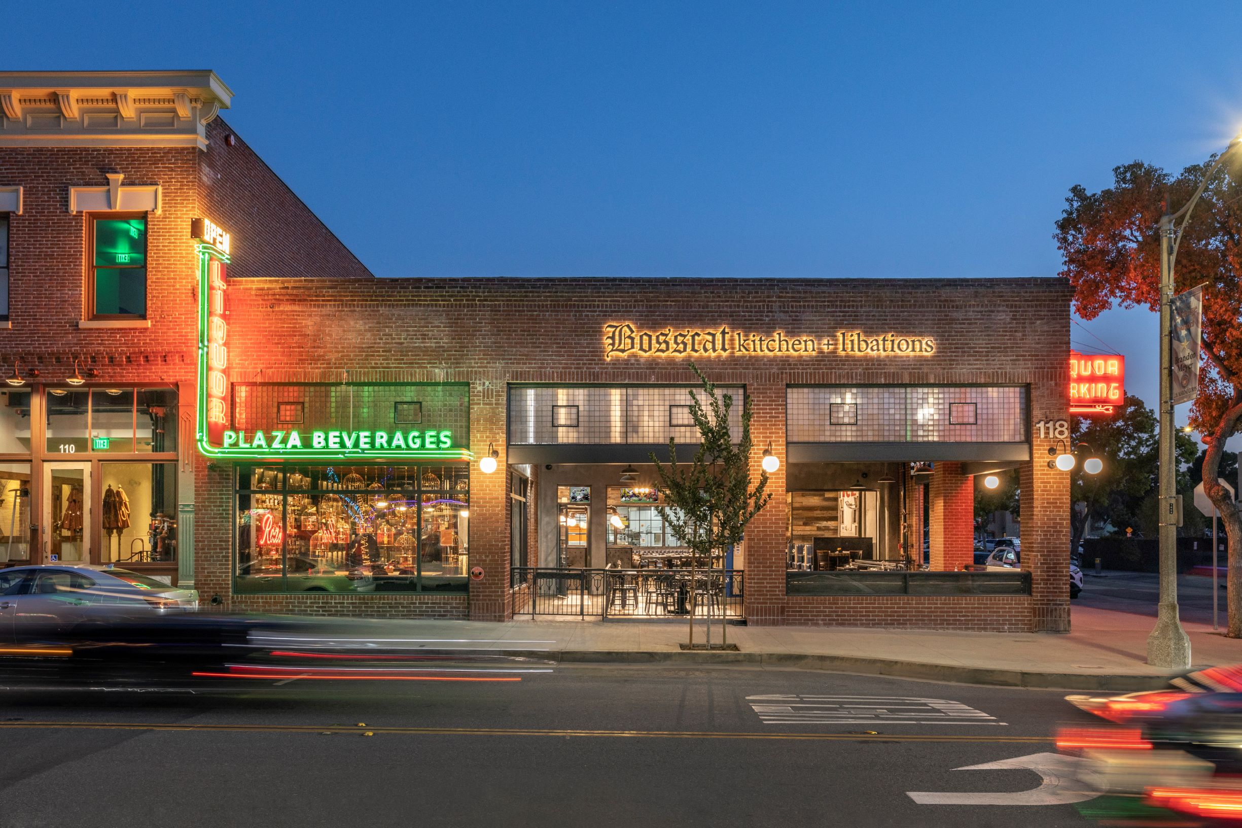
As architects and leaders at AO, we had the special opportunity to convert a historic corner building in our own neighborhood of Old Towne Orange, California., where our own offices have been for more than 45 years, into a contemporary American whiskey bar, Bosscat Kitchen and Libations. Understanding the significance of the local landmark, which housed Rod’s Liquor for 71 years, we worked together with restauranteurs and co-owners John Reed and Leslie Nguyen to preserve the iconic liquor store’s aesthetics while also delivering on the restaurant’s notable brand experience for its second location.

Out with the Old, In with the Old
The care for preservation was top-of-mind from the start. The owner, Rick Fraser, whose dad Rod founded the former business in 1949, was looking for a restaurant group that would maintain and pay homage to the 105-year-old history of the building. He found that in the Bosscat team, who fell in love with the vintage relics and distinctive layout of the store, which had originally been an auto shop and gas station. Bosscat partnered with AO to overcome the challenges of transforming the space into a restaurant in a historic district. To begin, our design team helped secure a conditional use permit to allow the property to be used as a restaurant in an otherwise zoning designation. We completed extensive research into the rich history of the Orange Plaza and community and conducted a significant restoration and retrofit of the shell before addressing the build out.
Next, the creative design phase began. We found through our research some old photos from 1929 and discovered that the old vehicle pass-though (formerly used for pumping gas and servicing cars) had not been in the original layout. We saw this as an opportunity to create an enclosed and secure patio that still felt open and expansive in the year-round temperate climate of California. The exterior brick and mortar façade was carefully restored, and an additional brick column was added seamlessly to the front of the building, balancing the look of the entrance. We also kept the historic prism glass details and wide, open bays that open out to the sidewalk. The design turned the clock back nearly 100 years.
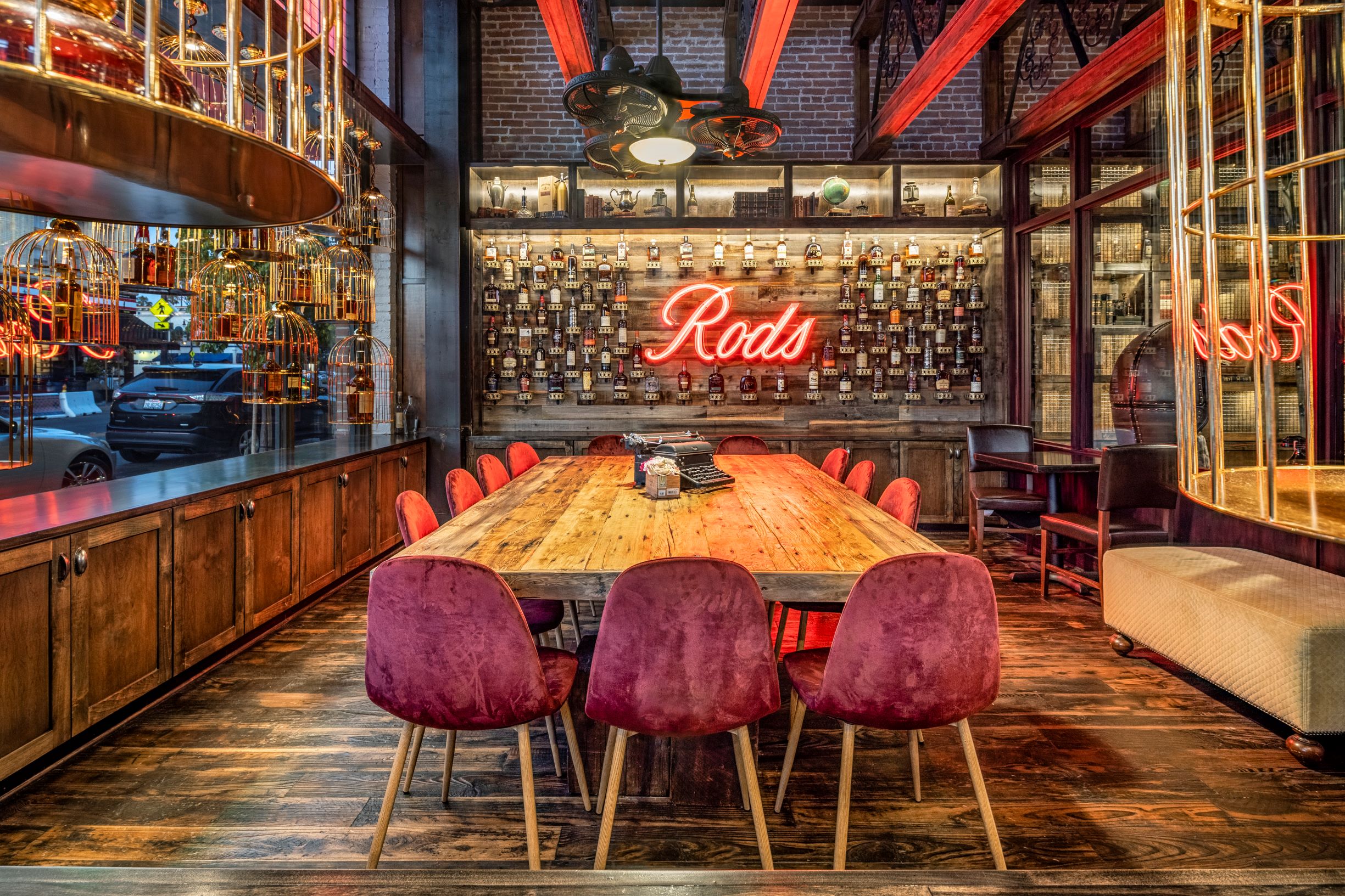
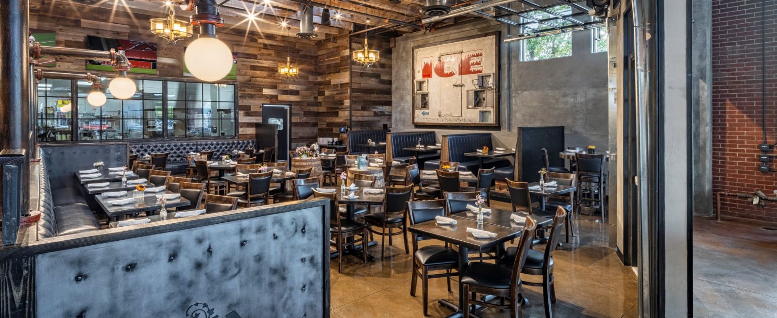
Always seeking to repurpose, the owners and design team salvaged pieces everywhere. The old ICE Machine’s front metal panel is now hanging as art, reclaimed oakwood floors were used to make a table in the tasting room, we have two antique gas pumps on the patio, and the original tin ceiling was preserved. These touches, among many others, add to making the restaurant a warm and welcoming place. It has something that some newer buildings are lacking… character.

Listen to the Community
It feels like a great accomplishment to create a space that is respectful to the community, while also delivering on the vision and practical considerations of the client. It’s a balance making sure everyone is satisfied. The only way to truly do that is to make sure you are meeting with and listening to the community voices. We communicated with the city and their preservation historians throughout the process of this conversion to hear their concerns and guidance. One example of compromise among the interested parties occurred in the whiskey tasting room, set aside from the main dining area. Our client wanted to create an intimate atmosphere with dropped ceilings, but when the demo revealed vintage tin ceilings that matched the exterior portico the city felt strongly about keeping them exposed. The solution was in adding faux trusses in that semi-private space that gives the impression of a dropped ceiling, when in fact if you look beyond them you can see the original tin ceiling is still there.
In addition, the original liquor store only took up a fraction of the building, while walls closed off vast storage behind. Unveiling the huge hidden space, which had impressive wooded trusses and vintage skylights hiding behind, was one of our greatest delights, especially when seeing the surprise in the eyes of former clientele. Where once was a 1,000 square-foot single-story mom-and-pop-liquor store with drywall and a dropped T-Bar ceiling now exists a bustling restaurant and bar in an exposed historic shell, encompassing 5,600 square feet.
And in a touching homage to Rod’s Liquor, the Fraser Family and the historic Orange Plaza; the original and newly restored neon signs still shine brightly advertising liquor, albeit now it’s to be found inside in a gastropub and whiskey bar. The success here is allowing the past to drive the present and the present to embrace the past.


