Chef On Call: Bringing a Brand’s Ethos to Life
3 Min Read
When Chef On Call, secured a London, Ontario site for a third location, they turned to Sansa Interiors, who had designed their second location to create something authentic to the brand’s ethos.
“This is one of the benefits of continuing to work with an interior designer on consecutive projects, particularly for restaurant interior design: you develop a strong relationship and can work together to create something unique, functional, and beautiful,” said Sansa Founder Jude Kamal.
The full-service restaurant serves gourmet, late-night comfort food and is popular with students and young professionals so the design needs to reflect their laid back and unassuming vibe by using reclaimed barn wood and exposed concrete balanced with fun and colorful graphic elements, Kamal said. Sansa Interior’s goal was to reimagine their existing aesthetic with a few unique twists, while still maintaining a distinct visual connection to the other two locations.

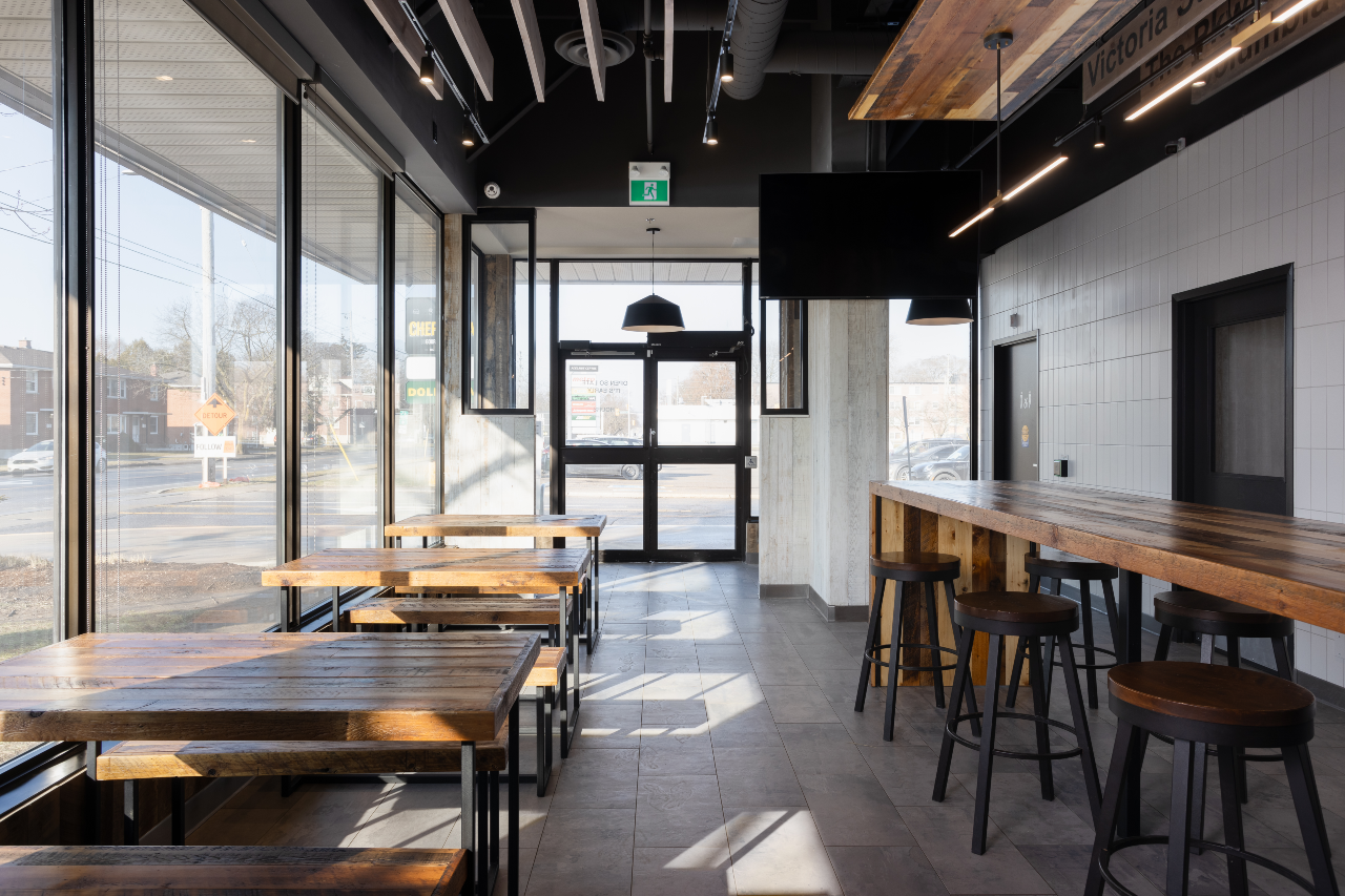
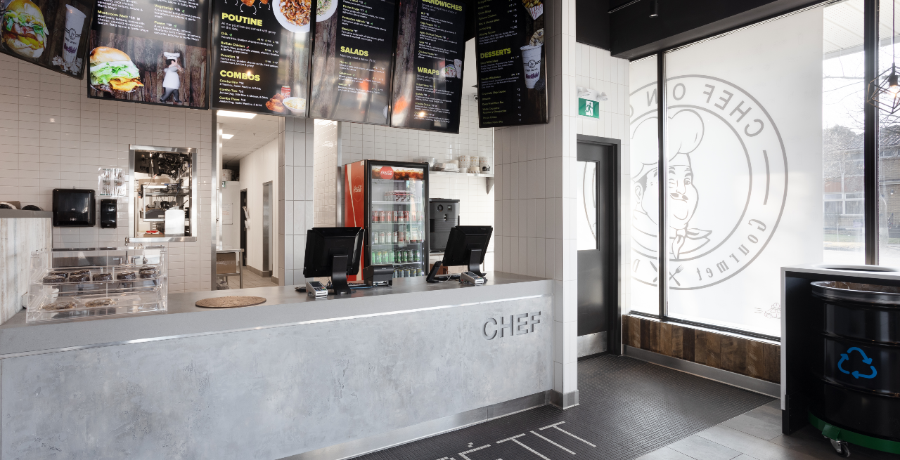
Keeping the other locations in mind, the concept for the London Chef On Call location played up the existing natural palette and materials while keeping it as clean and simple as possible. To maintain continuity between locations, they used the restaurant’s signature rustic barn board, reclaimed wood, concrete floors and open ceilings and the straightforward color palette of black, white, grey and brown-the perfect backdrop for the playful pops of colorful graphics that Chef On Call is known for, said Kamal. As the third iteration of the chain’s identity, they took the opportunity to play up the finishes and create some unique design moments that really bring the space to life.
"One example is the tile: for this location, they used a larger format and mixed matte and glossy finishes to create unique and ultra-playful accents,” said Kamal. “They also added some interesting touches and special little moments like engraved seating, unique lighting fixtures and extra wood accents throughout to make the London location really stand out. The simplicity of the palette and intention behind each detail creates the perfect atmosphere for diners to enjoy their meal and the Chef On Call experience.”
Kamal noted that the planning and design considerations that needed to be made for this project were extensive – meaning the drawing sets were extensive, as well. Working with a commercial landlord meant they needed to obtain their sign-off on initial plans before submitting for permit and follow their strict criteria manual. There was also some serious coordination needed to meet engineering requirements, including mechanical, electrical and plumbing, to ensure that both the restaurant’s needs and the Ontario Building Code regulations were met.

On top of that, they created detailed mood boards, interior design drawings, renderings, and FFE (Finishes, Fixtures and Equipment) schedules to bring their cohesive – and client approved! – design to life. To ensure everything was built to specification, they provided their contractor with every detail from finishes to millwork pieces, tile layouts, light fixture placement and so much more.
“Once the design was complete, we provided the contractor with a full set of drawings, spec sheets and schedules which they used to source the required materials,” Kamal explained. “This process helps the contractor to manage their own timelines and if an item is discontinued or on back order, they help Sansa to find alternatives. It’s a win-win for everyone because it gives the contractor an opportunity to familiarize themselves with the project, and means the designers have support when it comes to receiving materials – like the close to 50 pieces of equipment required for the kitchen.”
For this project, Sansa worked with Build It By Design, who uses an online system to request approval for site changes, streamlining the process for the designer, and the client. It was also the Build It by Design contractor who initially discovered the concrete load-bearing wall in the center of the space, and they notified Sansa right away. This helped Sansa get started on a solution as quickly as possible to keep the project moving.
Build It By Design gave Sansa an eight-to-ten-week timeline for construction and stuck to it. The size of this project was 2500 square feet and was completed in 10 months with a budget of $600,000.

