Central Kitchen Features Blended Personality
3 Min Read
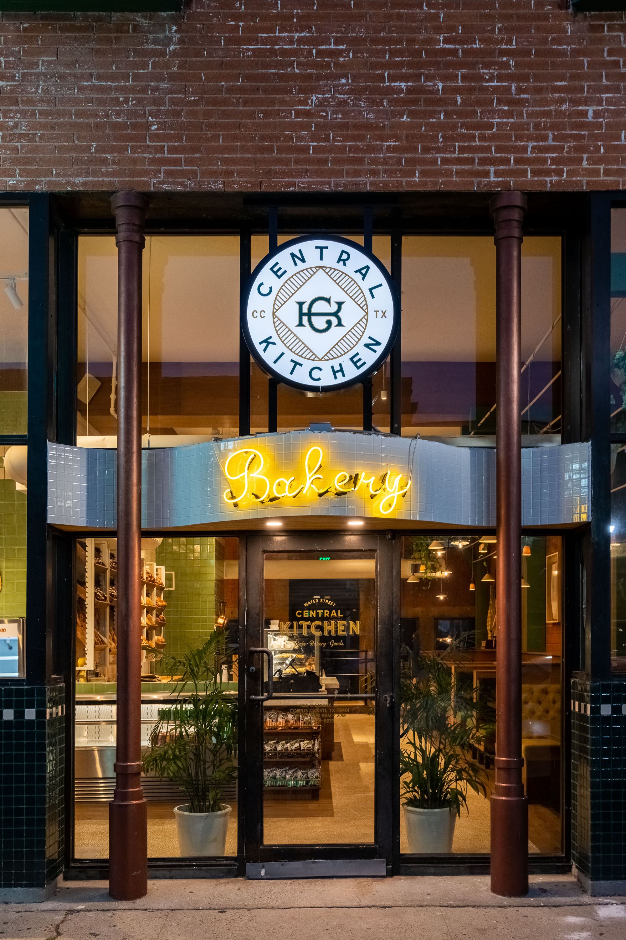
Tailored, classic details give Central Kitchen a uniquely blended personality that reflects the character of its Corpus Christi locale and feels like home – or in owner Richard Lomax’s words: “A really damn good bakery that meets people where they are.”
To complete the 3,500-sq.-ft. remodel, he turned to Houston-based gin design group. The award-winning firm has spent the last decade shaping Houston’s burgeoning hospitality scene.
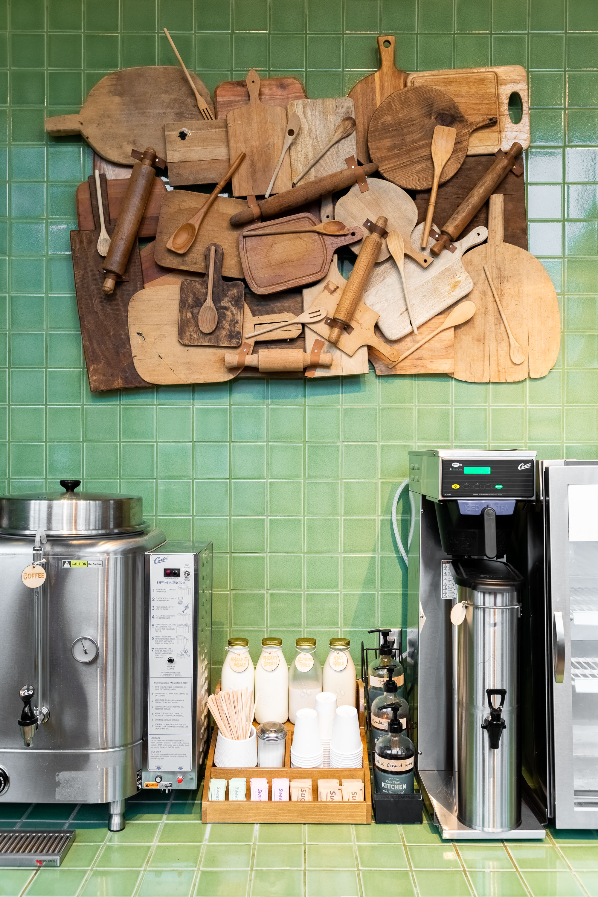
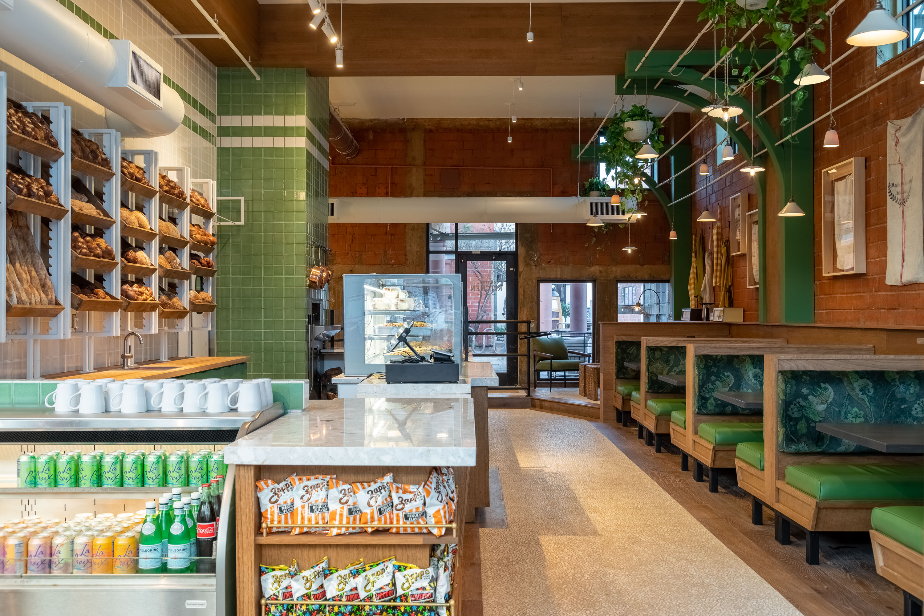
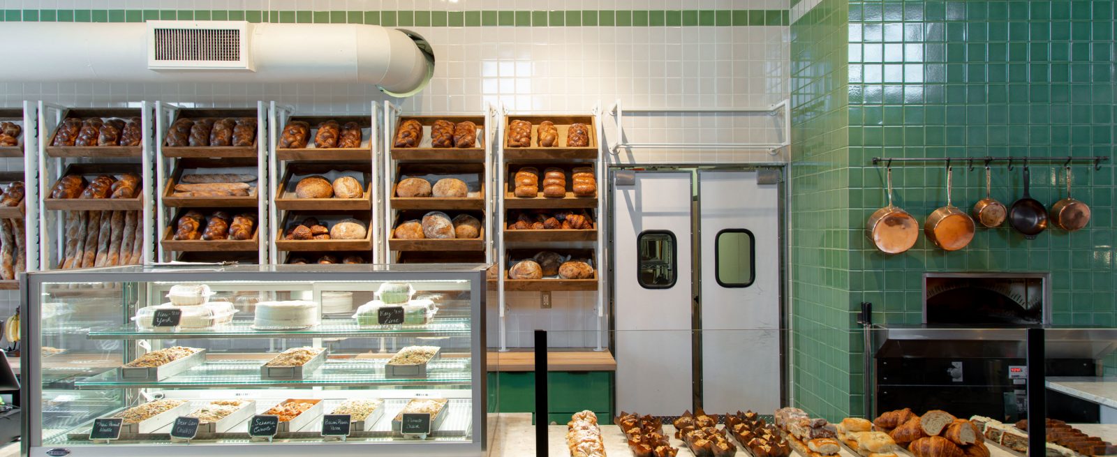
The interior is clad with floor-to-ceiling green and white handmade tile. Warm wood tones abound, accented by terracotta and greenery, and touches of nostalgia, like individually sourced vintage flour sacks framed on the walls and a custom collage of cutting boards and rolling pins by local artisan Hannah Bailey. Copper pots stand out against the green tile over the wood burning oven, and roomy upholstered banquettes invite guests to hang a while.

Other design elements include:
● Countertop facade made of custom hand turned wood rods, inspired by balls of dough
● Custom adjustable bread shelving display
● Handmade colored clay tile walls that transition with the accent stripes to guide you through the narrow space
● Arched tile passageway into the working dough room
While the design gives a nod to the French-influenced New Orleans landmark Cafe du Monde, it also stays true to its Gulf roots through the thoughtful display of vintage photographs, news clippings and found objects. Just as carefully shown as the local memorabilia are the baked goods and treats.
To learn more about the project, Modern Restaurant Management (MRM) magazine reached out to Gin Braverman of gin design group.
What was the process of creating this design, particularly of adding design elements that evoke the essence of a bakery?
We wanted to dip into some nostalgic old world charm to create something that felt natural in the historic building – and were inspired by the iconic French-influenced landmark, Cafe du Monde. It is all the little touches – cantilevered sconces, natural woods, and artisan tile – that when you combine these visual elements with the smell of coffee and fresh baked bread, you are transported to a simpler time and invited to slow down and enjoy your morning.
The details of the bakery were so fun to incorporate – we loved the idea of turned wood that was reminiscent of balls of dough around the service counter. The adjustable bread shelving was a practical way to store all the baked goods, display them for customers, and add a unique design element along the wall.
We always look to utilize local talent, and the cutting board/rolling pin collage was created by Houston based artist and former gdg studio manager Hannah Bailey.
What were key challenges bringing the project to fruition?
The narrow space was the main challenge. We wanted to make it feel open and bright and used horizontal tile bands to unify the architecture and the tall custom vertical bread racks to draw the eye upward.

How does Central Kitchen have a “blended personality?”
We intentionally manifested classic bakery elements with a modern approach. For example, the turned wood posts were handmade by the owner with our direction to keep them uniform which translated in a more modern way than a typical balustrade. Everything feels like it could have been around for a century but also very current. The look is fresh and polished for the growing city, but still harkens to its low key, unassuming roots.

How does the project “meet people where they are?”
It was important for the owner, Richard Lomax, to maintain an authentic atmosphere to fit in within the rest of the block – which he owns and includes other concepts from his restaurant portfolio – while bringing an approachable yet elevated bakery concept to life. He wanted to create a hub of food and beverage concepts that bring value and style to the area without abandoning the coastal town’s blue collar roots. Whether it’s a local surfer or a tourist in town for the beach – we wanted Central Kitchen to be welcoming to all.

