Bringing Comfortable European Dining to Downtown Nashville
4 Min Read
Newly opened Ophelia’s Nashville strives to create a classic Italian cafe vibe while fitting into a vibrant urban streetscape. Located in the heart of the city’s evolving financial district, the 2,700-square-foot neo-Italian establishment reused the existing retail area at the base of the historic L&C Building.
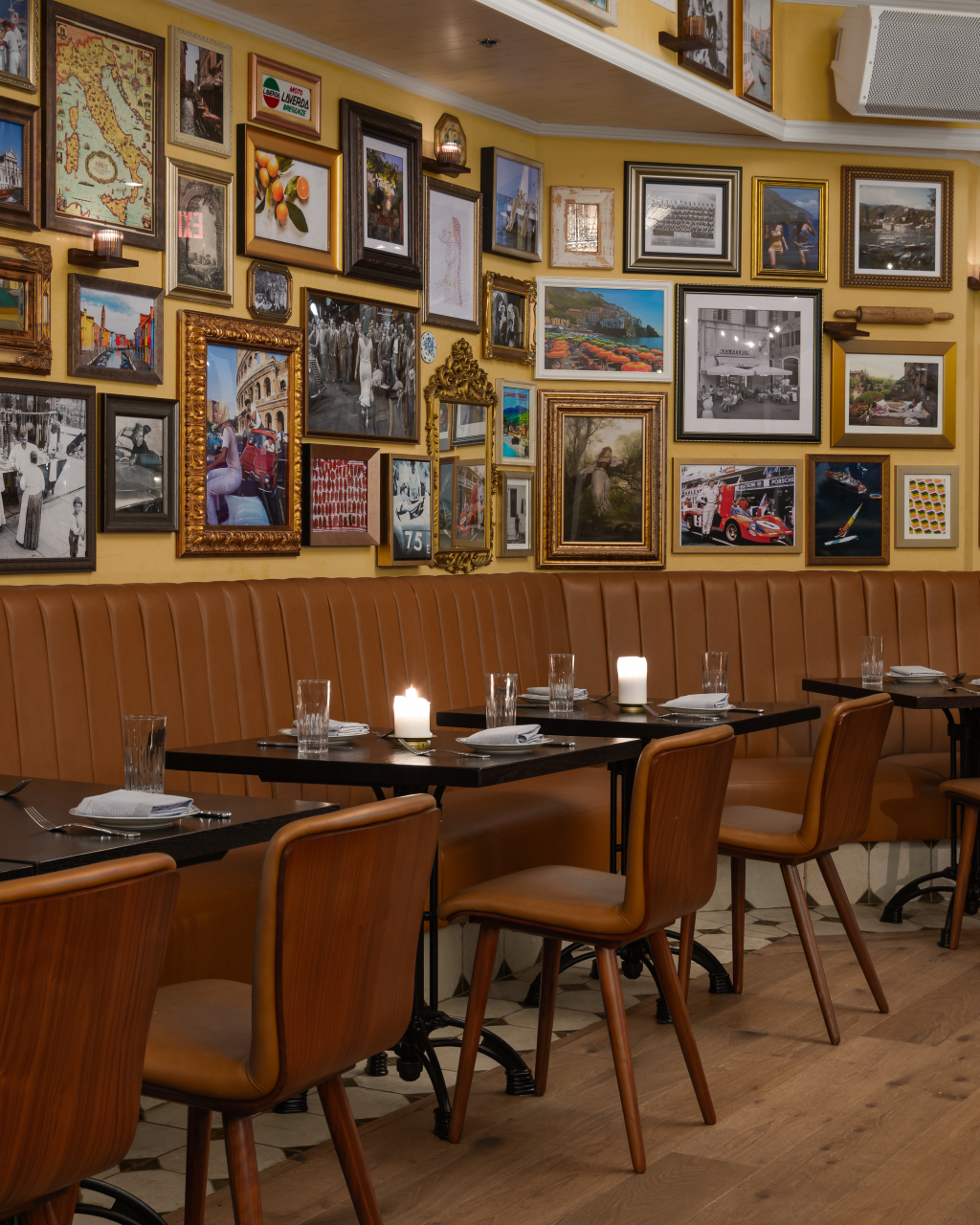
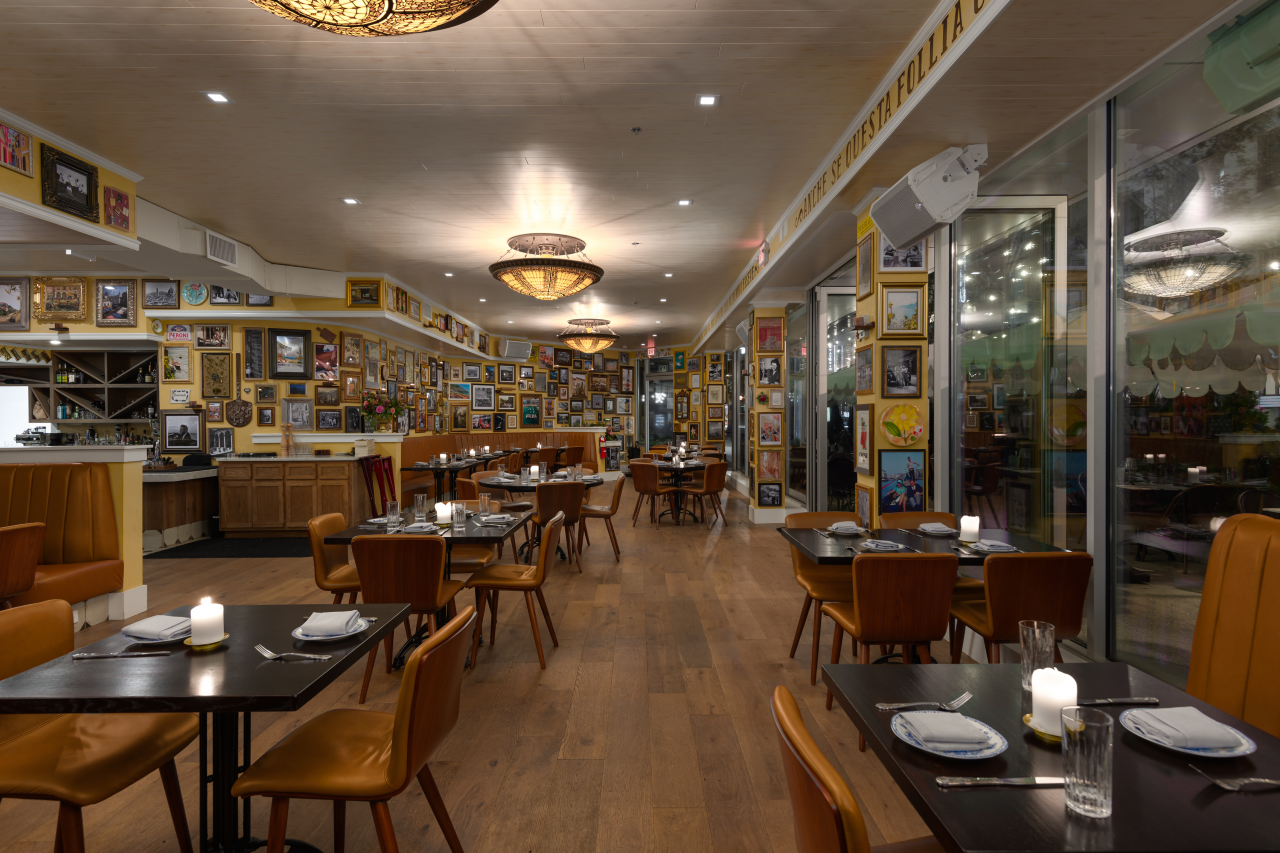
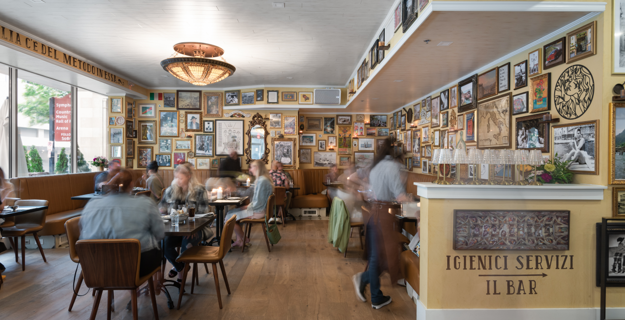
Completed by Architect of Record and General Contractor The Bradley Projects and Certified Construction Services, the project uses carefully curated materials including rustic-but-clean white ceiling boards that contrast with the simple plaster walls and intentionally overcrowded choreographed artwork. Walnut wood flooring is carved out to allow Italian tile to be laced in for unexpected yet functional moments. A glass facade is incorporated across the entire building face with sliding panels to blur the edges between indoors and outdoors.
The menu focuses on Italian-inspired cuisine created by Chef Partners Jamie Lynch and Adam Hodgson utilizing imported Italian ingredients and local Nashville products.
For a deeper dive, Modern Restaurant Management (MRM) magazine questioned Jared Bradley, AIA, NCARB, President and Founder of The Bradley Projects.
What was the process of working on the project and how long did it take?
The process of working on Ophelia’s began with direct collaboration between the chef and his team to envision the kind of food and drinks for this concept. Though the vision underwent a few adjustments, the result is a cohesive concept based on the idea of the familiar and comfortable but with a slightly elevated presence. The design challenge was creating a space that exuded a sense of comfort and familiarity while feeling upscale, unique, and exclusive. From conception to completion, the project took a total of nine months.
What were the key challenges of the project?
In creating Ophelia’s, there were many challenges due to the absence of proper infrastructure for a restaurant of this caliber, coupled with prolonged delays in obtaining permits in the Metro Nashville area. The permitting process for retrofit projects like this one has become as challenging as ground-up projects in Nashville. Additionally, the previous restaurant at this location had severely outdated infrastructure, presenting another challenge for our team.
In projects like these, our focus isn't always on our personal aesthetic preferences but on supporting our clients, especially when they possess a strong artistic vision. Our team at The Bradley Projects believes that the best architects don't just seek to execute their own ideas but ensure that the best ideas are brought to life. In this instance, the owner contributed valuable insights and concepts that our design team fully supported.
The concept of high-density, meticulously curated portraits and paintings played a pivotal role in shaping the establishment's interior, an idea that the owner brought to the table. They also introduced the concept of rich, large, and ornate stained glass ceiling-mounted light fixtures, which gracefully float through the space, creating an air of sophistication.

Were there additional challenges being in a historic property?
This project was situated at the base of a historic high-rise building in downtown Nashville, which presented significant obstacles when coordinating and retrofitting new infrastructure. Tasks such as updating fire suppression systems, overhauling HVAC and mechanical kitchen hood requirements, and configuring entirely new grease traps proved to be large hurdles for the project team to overcome.
As we designed the project from the inside out, we paid utmost respect to preserving the original exterior elevation of the historic building at ground level. Consequently, we had no issues with historic coordination for the project. This new project played a crucial role in being a responsible steward for such an iconic building in downtown Nashville.
The fusion of the interior concepts brought forward by the building owner, alongside a simplified and freshly landscaped patio, gave the historic property a more fitting front entrance and an outward-facing facade that resonates with the public. Ophelia's is now a customized and precise addition to this historic building.
What elements did you use to create the right ambiance?
The cuisine of Ophelia’s is inspired by comfortable and elevated Italian dining. As we kicked off the project, we began to ask: how can we design a space that could convey this rich notion? Over several months of close collaboration between the restaurant and the design team, the resolution became clear. We achieved this by incorporating warmer wood materials, such as a wooden ceiling, blending eclectic artisan tiles, using thicker plaster finishes, and introducing an interior design package that introduced more rustic and uniquely identifiable elements into the pristine space. This approach struck a perfect balance between the old and new realms, creating a space that harmoniously complements the ever-evolving and rich Italian menu.
Additionally, our team aimed to create an immersive stage-set experience that fosters a 'seating in the round' feeling within the open floor plan. This design emphasizes a clear direction and focus, drawing attention to the active streetscape of downtown. The elevated patio creates a buffer between the busy city street and Ophelia’s patrons, allowing them to have the best views of the action.

What was your favorite part of the project?
My favorite part of this project is the restaurant's layout and posture. It's not every day that you have the opportunity to create a restaurant with a distinctive 'sideways' flow and presentation. What makes it truly exciting is how the space transforms into a theater in the round, with the busy streetscape and nightlife outside taking center stage, becoming the main event. The slightly elevated patio and its extended length mirroring the interior layout of the restaurant contribute to this immersive experience.
Transparency, flow, and fluidity drove the design from our perspective. In this unusual space, situated in an amazing location, these elements are the primary driving factors that set this project apart. It's like enjoying dinner and a movie every time you visit. Additionally, I enjoy Ophelia’s hidden gem, the wine bar tucked away in the center. It's the perfect size and location for the restaurant, offering guests a quiet, cozy, and comfortable ambiance.
What has the response been like?
The response to Ophelia’s has been overwhelming. We always encourage people to experience the restaurants we work on and provide their honest feedback – the good, the bad, and the ugly. Without fail, this restaurant has garnered the highest praise from everyone I know who has dined there. People are pleasantly surprised by the unique experience it offers compared to a typical restaurant.
While many guests may expect a normal Italian restaurant, they find themselves immersed in a European Italian restaurant, both in terms of the quality of food and the quality and uniqueness of the space. Ophelia’s possesses a magical quality, with multiple layers of charm reminiscent of the cozy Italian cafes and European Italian restaurants common overseas. Ophelia's truly brings a comfortable European offering to downtown Nashville.

