Behind the Redesign: Flexibility for Marco’s Evolution
3 Min Read By MRM Staff
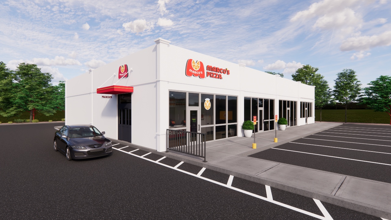
Setting a new brand standard, Marco's Pizza recently unveiled a store redesign beginning in the Boise market at corporate-owned store.
“Our new store design marks a pivotal moment in our brand’s evolution, serving as a cornerstone for our growth and the next chapter of our journey,” said Tony Libardi, Co-CEO & President of Marco’s Pizza. “This redesign is not just about aesthetics; it’s about enhancing the customer experience, improving operational efficiency, and creating a welcoming environment that reflects our commitment to quality and innovation."
In addition to aligning with new brand platform, design updates include:
- A creative refresh designed to deliver a brighter, more modern look and feel across all touch points
- Pick-up door and pick-up window options for a frictionless customer experience
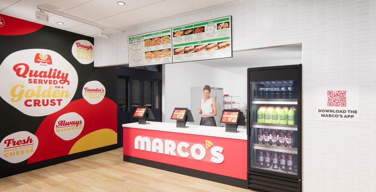
- QR code/mobile access in-store on a designated wall for customer engagement
- Strategic placement of beverage coolers for employees and customers, as add-on purchases
- A warm and welcoming dedicated guest waiting area
- Integration of new equipment, including the testing of warming racks and pizza lockers that hold multiple orders of hot pizza with quick and secure access, designed specifically for pick-up and third-party delivery needs.
To learn more about the redesign effort, Modern Restaurant Management (MRM) magazine reached out to Gerardo Flores, Chief Development Officer, Marco’s Pizza.
Overall, how long of a process was the redesign and what were problems it helps resolve?
We’ve been working on this redesign for roughly a year and a half. Our aim was to enhance the guest experience while strengthening and streamlining operations.
The aesthetic design of the store mirrors our new brand platform, But Wait, There's Marco's™, that launched in April 2024. We aimed to bring a fresh, contemporary Marco's brand aesthetic designed for the long term. We also prioritized creating a design that would be compatible for all real estate footprints while being cost efficient for franchisees as we continue to expand. We knew implementation was an important aspect, and therefore prioritized its debut in our corporate test market.
What kind of data points and research were utilized to complete the redesign?
As a brand, we prioritize innovation and have made significant investments in R&D to ensure we’re able to capitalize on opportunities that strategically make sense for our brand.
The task force behind this project leveraged data and insights from various vendor partners, while also utilizing in-house technologies, consumer surveys, franchisee-input, and competitive analysis to make data-driven decisions.
In what ways does the redesign balance the aesthetic elements with operational ones?
While the redesign promotes an updated look, we were able to remain strategic and operational with the new design. For example, adding a designated customer waiting area helps eliminate overcrowding throughout each store. The new colors and signage remain appealing to the eye, while also adding interactive elements such as the addition of a designated wall with a QR code for mobile access in-store. Furthermore, the testing of new equipment, including warming racks and pizza lockers that hold multiple orders of hot pizza with quick and secure access, are operationally designed specifically for pick-up and third-party delivery needs.

How does the redesign work for varied real estate footprints?
The design can be easily implemented to fit various real estate footprints. This model provides cost-efficient variations depending on franchisee and market needs. It could be something as simple as the new warming racks and pizza lockers being shifted based on the layout or the location of the in-store QR code depending on the available wall space. Another example would be that an end cap could have pickup windows and doors to make for more efficient and streamlined ordering.
How does the redesign help the brand move forward and be responsive to guest needs?
This redesign helps our brand stay current within the restaurant space through fresh colors and branding in each restaurant. Guests want a seamless experience when ordering, so by adding a clear journey from ordering to pick up, they know exactly where they need to be whether it is to order or pick up food. Our multiple ordering points allows for guest convenience as they can order either online/mobile, counter, or pickup window. Each store now will also provide a designated waiting area for customers to be comfortable while their food is prepared.
How do you modernize and redesign, while still staying true to the brand?
The new look is a fresh, contemporary Marco’s design that can withstand the test of time. Our team designed new impact branding and a focal wall for the restaurants that deliver the brand values Marco’s was founded on. Along with in-store branding, we still utilize brand product and legacy digital storytelling to share with customers where we began. This redesign was inspired by our But Wait, There’s Marco’s platform, which is designed to disrupt ordering behavior and remind consumers of a tastier option, and the updated marketing and color schemes bring that flavor to life aesthetically when they step foot in the door.

