Attract More Customers with These Simple Website Improvements
3 Min Read By Steve Comer
A restaurant’s website is an important information tool for your customers. Since this is the case it is crucial to update your website with the most recent and relevant information for your establishment. Knowing the kind of content your patrons are looking for and what changes to make is just as important. A well-designed restaurant website will help bring guests from online into your restaurant’s front door. As a website developer, who has over 20 years of experience in the industry, here are a few ways I would suggest you update your website to attract business.
Simplify Your Website
Keeping your website simple will help get your message across easier than having a lot of motion, unnecessary photos and unimportant information. Remove all of the sliding picture panes, which often take up the most expensive real estate on the website. Instead, replace these sliding pictures with one optimized image. The image should be of what you are promoting at the moment or with your biggest money-making dishes. Having too many moving pieces can cause your website to load slower. Forty percent of mobile visitors will leave your site if it takes more than 3 seconds to load.
Have your phone number in the upper right- hand corner, accented with a color to catch the eye. Keep the overall color palate of your website on brand with your business. Adding bright and unnecessary colors can distract the person looking at your website from what you actually want them reading.
Another important aspect to your website is the font size. This may seem like a minor point but too many websites use small fonts making the site difficult to read, especially on mobile. When you increase the font size, even just a little, people will stay on your page longer.
Lastly, have a form somewhere on every page of your website where the guests can put in their name, email and phone number. This form can be for customers to leave questions and comments. Keep the form simple and easy to use. Typically, you will want to put the form link in the footer next to your logo and contact information.
Be Mobile
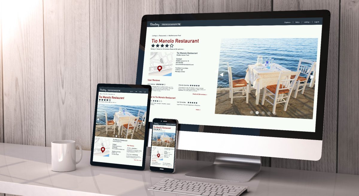
Sixty-one percent of mobile searchers are more likely to contact a local business if they have a responsive website that works on all devices. When updating the design of your website you should be thinking mobile first. All of the major search engines, have switched to a mobile first initiative in recent years. Your mobile website needs to look the best and then account for how the mobile design transfers to the desktop.
Ordering Online
The COVID-19 pandemic has more than doubled online food ordering and delivery. If ordering online is now a major part of your business, then you want this to stand out more. Making this section stand out can be done by adding a special color or font. You can also integrate ordering online into your main menu. Have an area on your menu where the customer can click to easily access the order online page. Having a couple different options for people to order online can help you keep the customer on your website and have them place an order.
Be Careful with Social Media Integration
Social media is an easy way to attract customers to your website but once they are on your page you don’t want them to leave or be distracted. When integrating your website with your social media accounts you want to bury your links on the page in order to keep people on your site. Once someone leaves the site to look at your social media it is easy for them to get distracted with notifications, messages and other content on their own social media accounts. Try to limit social media icons, especially on the homepage and guests will be more likely to stay on your website.
Navigating Your Website
For a restaurant website you should have certain links listed along the top navigation bar. These include, home, menu, events, contact us and order online. Be sure to make your navigation easy to use. You want your customers to get back to the homepage as easily as possible and not have to click back through multiple pages in order to reach it.
Making your responsive website easy to use will keep your customers on your pages longer and inform them of your opportunities you would like to promote. By keeping your site simple, customers will not be distracted and lose focus. Following these simple steps in designing your restaurant’s website will help you attract more customers.


