Email Showdown: Comparing Marketing Strategies of Shake Shack and Sonic
4 Min Read By Nora Snoddy
One of the best ways to generate ROI when facing evolving technology and consumer preferences is to develop a solid email marketing program. Email integrates remarkably well with other channels, and it’s proven itself to be the workhorse of the restaurant and hospitality industry. In fact, according to Emma’s 2018 Industry Survey, while 60 percent of restaurant marketers spend 10 percent or less of their time on email marketing, 42 percent find it to be their most effective marketing channel, and 30 percent plan to increase spending this year.
In this email showdown series, we’d like to compare the email strategies of Shake Shack and Sonic.
Sonic Drive-In is one of the largest fast food chains in the U.S., with more than 3500 locations scattered across the country. Shake Shack has far fewer locations than Sonic, but they’ve developed a cult following and are expanding rapidly into key markets. Both Sonic and Shake Shack have fairly robust email marketing programs, but who ultimately wins the inbox? Let’s find out.
Shake Shack
The Sign-Up Process
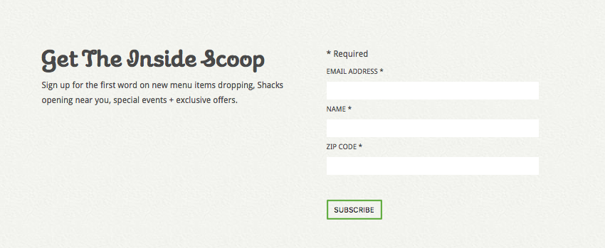
Shake Shack’s signup form sits at the bottom of their homepage and includes three fields: email address, name, and zip code. According toPrivy,every field added reduces signups by 25 percent. The fewer signups, the better.
After signing up, new recipients are greeted with this automated welcome email. Brands should take note of welcome emails. The average open rate for welcome emails is 50 percent, making them 86 percent more effective than email newsletters, yet only 57.7 percent of companies greet new subscribers with a welcome note. Also, Welcome messages typically have four times the open rate and 5 times the clickthrough rate of other bulk mailings.
The Welcome Email
Subject line: Welcome to the Shack Fam!
Preheader text: This is the start of a beautiful friendship.

This welcome email exemplifies exactly what a first-touch email should look like. For instance, the email:
• Greets new subscribers with a warm, branded welcome.
• Tells them exactly what to expect from future emails.
• And offers an exclusive discount for joining their list.
Then, after receiving this welcome, subscribers can expect to receive promotional and survey emails like the ones below:
The Promotional Email
Subject line: Give a Little, Get a Little
Preheader text: Deck the halls with Shack.
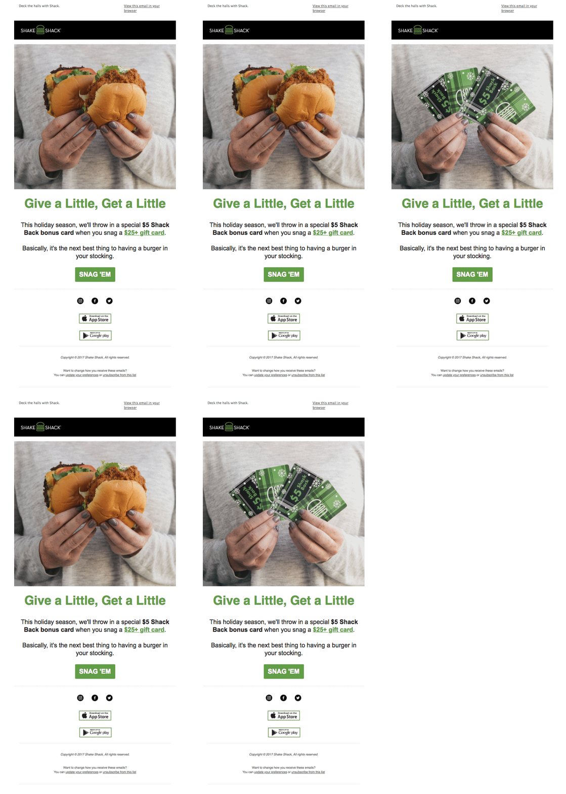
Shack Shack does a great job of making promotional emails feel engaging. This holiday campaign features an amazing GIF up top that grabs readers’ attention and helps quickly convey the point of the message. It follows the same recipe as the rest of their emails, featuring a branded header, some sort of hero image, a headline, short copy, and a single CTA.
Depending on the goal, whether it’s to welcome subscribers, re-engage customers, or to nurture new leads, templatized messages are a great way to scale marketing across sends easily and effectively.
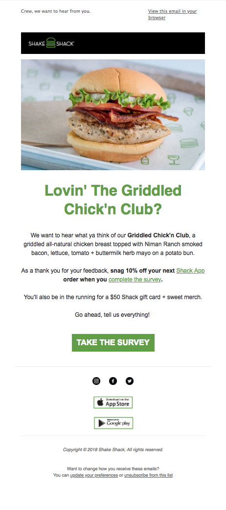
The Survey Email
Subject line: Penny for your thoughts?
Preheader text: Crew, we want to hear from you.
The Timely Email
Subject line: All of Us Rising Together
Preheader text: Who run the world?
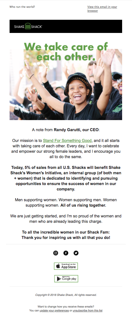
This email isn’t about sales or menu items. Instead, it’s a note from Shake Shack’s CEO about International Women’s Day and empowering female leaders. It’s nice to see a brand support a cause and— perhaps more importantly—not turn it into an excuse for a misguided sale (e.g. “Get a free drink in honor of women!”).
As demonstrated in this examples, it’s occasionally okay to send an email that has nothing to do with conversions. In fact, it’s a great way to build brand advocates and audience loyalty.
The App Promo
Subject line: You Asked, We Listened
Preheader text: New and improved, friends.
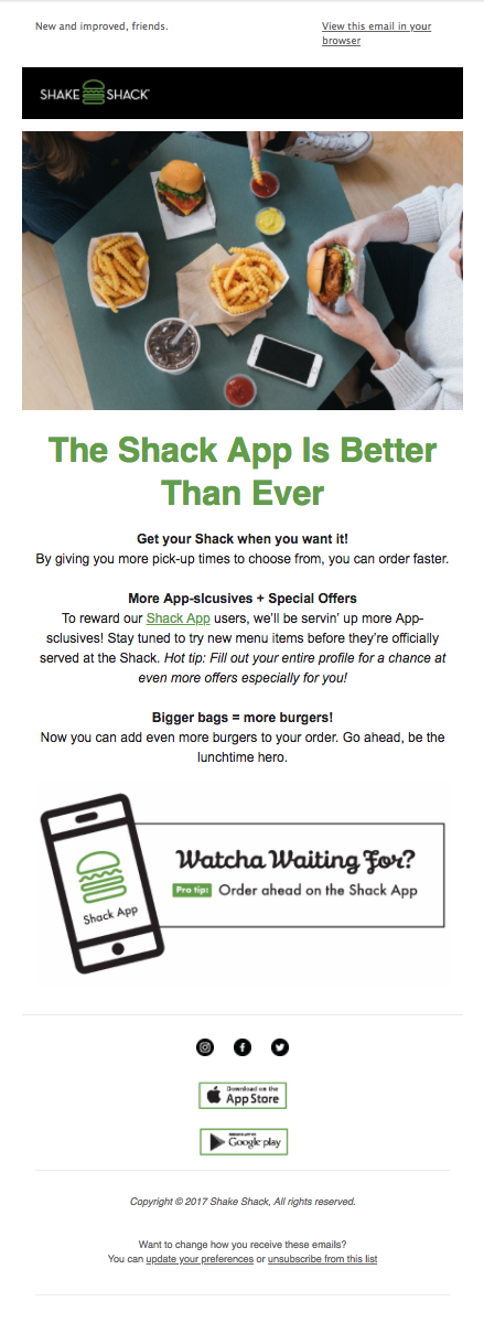
Shake Shack pushed subscribers to download their app every few emails. This is an excellent use case for a suppression list, especially for those not living near a Shake Shack. Instead of sending app promos, a suppression list could be used to alert those subscribers once a location does open near them.
Sonic
The Sign-Up Process
On Sonic’s homepage, it’s easy to find the path to subscribe to SMS alerts, but there’s no option to receive their emails. By signing up for an account, you can make it onto their list. The checkbox isn’t pre-checked (GDPR-compliance), but since they do send such great emails, it’s odd that they wouldn’t want to find ways to get more people on their list.
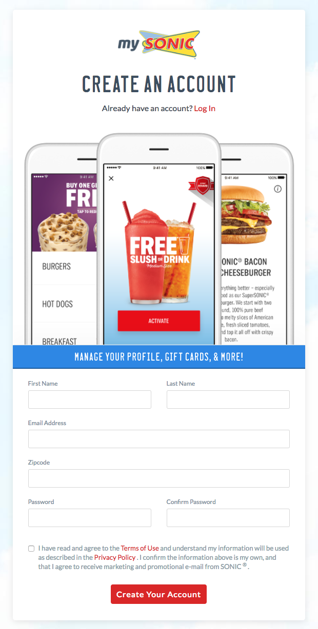
Unlike Shake Shack, they do not send a welcome email. Instead, you’re dropped into their regular send cadence, which includes emails like these…
The Promotional Email
Subject line: Guess What’s Half Price ALL DAY Tomorrow?
Preheader text: N/A

Sonic sends about 1-2 times a week, and their emails don’t appear to be segmented by demographics like location, even though they collect that data at signup. However, they do a great job of capitalizing on timeliness, often running promotions tied to current events.
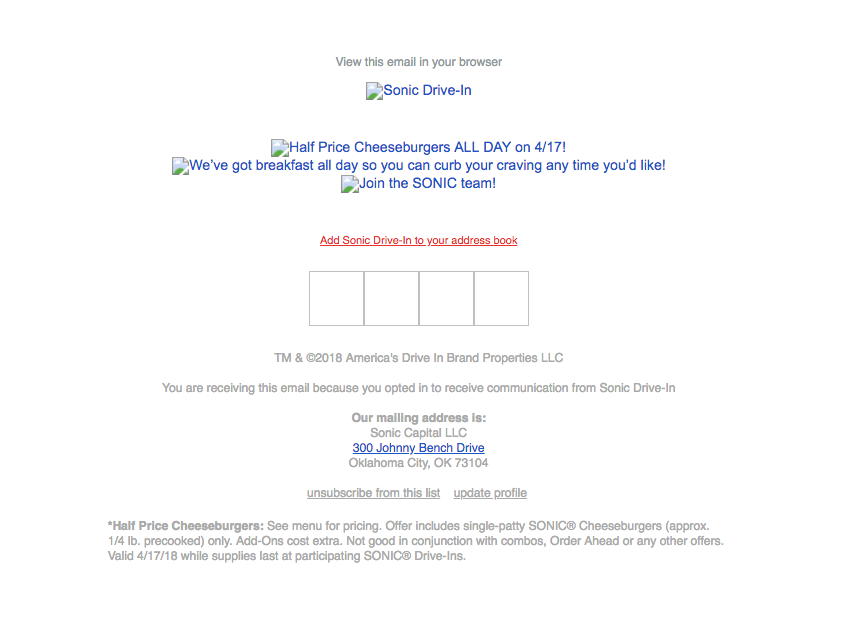
It’s all images. So when someone happens to view it with images turned off (as many people do), the experience isn’t so nice. Now, to be fair, they do use alt text, which helps preserve the message. But for comparison, here’s what that Shake Shack welcome email looks like with images turned off…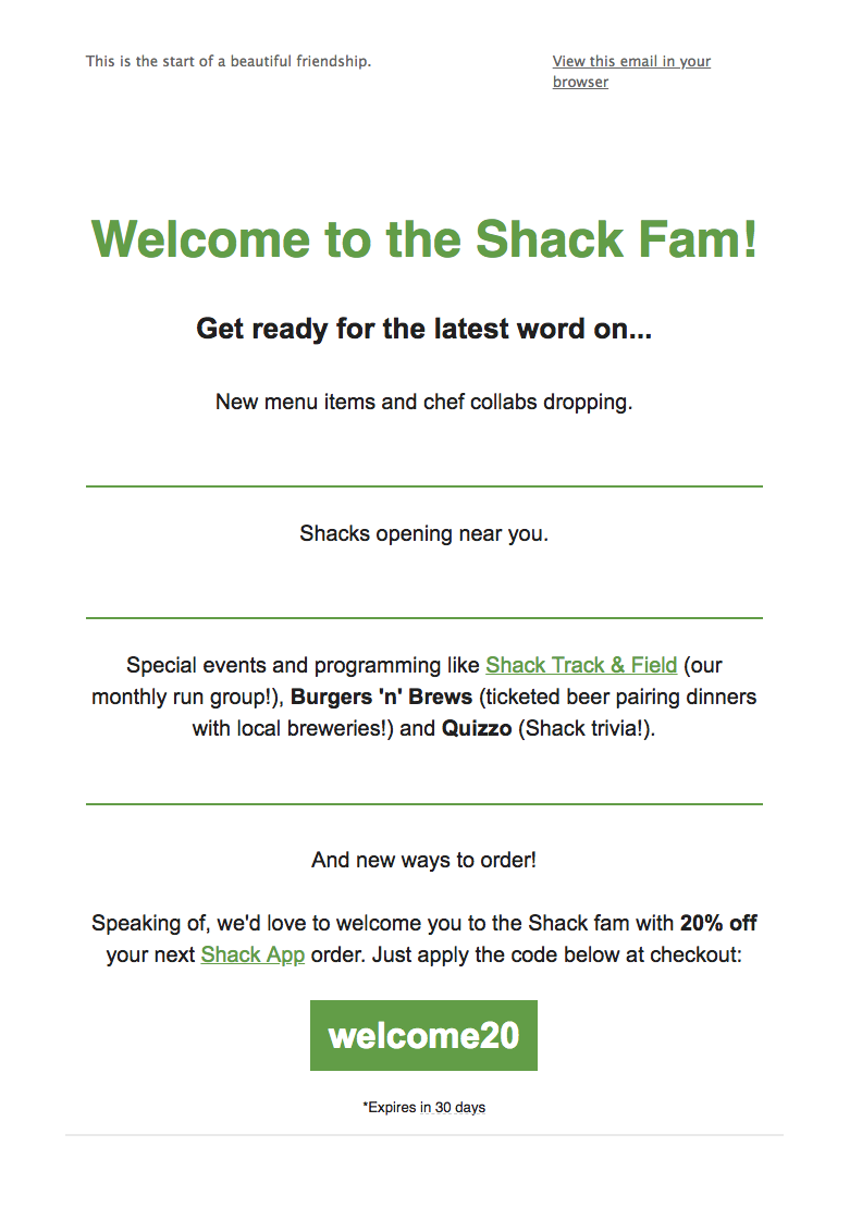 Since they use live text instead of images, the majority of the experience is preserved. Plus, they included a bulletproof button—a pro move that allows your button to display even if your recipient can’t see images.
There are ways to optimize for the images-off experience, but Sonic misses out on those opportunities.
The SMS Push
Subject line: Because We ❤ You!
Preheader text: N/A

Sonic goes heavy on SMS. Here, they do a good job of demonstrating the value you’ll get from opting into their text messages, and the focused message helps keep the call to action as clear as possible.
The Influencer Spotlight
Subject line: Say Hello to SONIC’s Newest Duo
Preheader text: N/A
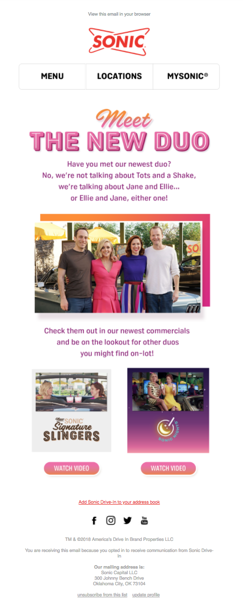
For restaurants, it’s easy to want every single campaign to be focused on menu items and deals. However, this example showcases how you can use content to boost interest and engagement. Sure—not every brand has highly produced video content and celebrity endorsements to work with. But even if it’s as simple as a spotlight on your chef or an interesting blog post, adding content marketing to your email strategy can do wonders.
The Social Campaign
Subject line: Show Us How YOU SONIC!
Preheader text: N/A

Sonic utilizes email to promote a social campaign they’re running. The more audience touch points, the better, so always remember that email doesn’t need to be its own silo.
The Verdict
Sonic utilizes content in their email marketing and ties email to their other channels, but their design choices and lack of signup opportunities signal that email is a bit of an afterthought for the brand.
For Shake Shack, however, their very intentional email design, the inclusion of a welcome email, and frictionless signup form show that they’re truly invested in email marketing. While they could be doing more with segmentation and personalization, they’ve developed a solid email program overall.
WINNER: Shake Shack

