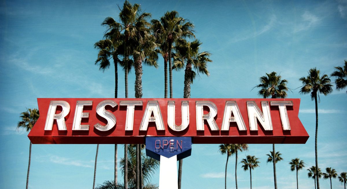
How to Choose the Best Restaurant Signs for Your Business
4 Min Read By Anthony Kreychmar
Attracting customers into your restaurant starts with their ability to easily identify and find your business. This is why it is crucial to have a signage strategy. The biggest factors to consider when developing one are: location, size, and design. Consider this to be your first impression on any new customers — what do we want them to see?
Keep in mind that primary outdoor signage should be large including a logo, text displaying business name, and potentially smaller text with a restaurant slogan. Presenting the message to the customer from a variety of angles and putting an emphasis on visibility can be key.
After displaying the restaurant name and logo, there’s more work to do to incorporate smaller restaurant signs around the business to promote specials, new menus, hours, etc. It may seem dramatic to say, but it does impact the customer experience.
Outdoor Restaurant Signs
Any restaurant sign strategy begins with the outdoor sign with the aim to draw guests inside. Start by thinking about your target customers – Are you a family restaurant? Do you attract college students for late-night eats? Are you a healthy food option for vegans? Defining your target audience makes development much easier. Customers can identify with a brand that designs for them and creates a better customer experience.
When picking a sign, the three main factors to decide are the type, location, and design. Be sure to note any rules and restrictions your municipality has on signs.
Sign Types
Back-lit Signs: They provide a more modern look with extended nighttime visibility for customers to see.
Hanging or Blade Signs: These are very common. They are compact in size but serve as a good starting point to advertise your restaurant.
Pylon Signs: A tall option to consider, they cover a wide area and can be seen from many angles for incoming traffic.
Illuminated Signs: Primarily designed to draw attention, consisting of bright lights and neon colors to attract customers.
Channel Lettering: Most commonly used by the Starbucks of the world to display brightly with strong nighttime visibility over large areas.
Lightbox Signs: Lightbox signs are common in busy areas, located above restaurant locations. They have the ability to display graphics and light up at night as well.
Sign Location and Design
The location of your restaurant is a major factor when deciding how to properly place signage. For example, a restaurant located on the corner of a busy street would be better suited to display something that can be seen from both angles.
A restaurant located in a cluttered area would be forced to innovate differently to gain visibility. A good example of this would be an illuminated sign displaying restaurant name, logo, and slogans to differentiate.
Other restaurant sign ideas could include the illuminated lightbox option. This would be best used in the busiest of areas where a higher visual could be beneficial.
The location and design of outdoor restaurant signs becomes the most important aspect of a restaurant’s strategy to consider, but getting customers there is half the battle. Once they get inside, how can we optimize their visit? This is done with indoor signs.
Indoor Restaurant Signs
The strategy for indoor signs will be a bit different than outdoor. Use indoor signs to detail your pandemic procedures, promote your specials, display branding, point customers to the right places to make the interaction seamless, and point out features offered inside.
There are a bigger range of indoor signs to choose from and it can be overwhelming at first to try and narrow it down. Within every indoor type to choose from, there are variations. Here is an in-depth perspective on how to maximize results in the three primary restaurant signage factors.

Sign Types
Window Decals and Clings: Window decals and clings are a smaller option to post around the restaurant to advertise things such as hours and specials.
Floor Signs: Best used to point to bathrooms, safety instructions for staff, off-limit areas to guests, and other useful information without occupying physical restaurant space.
Point of Purchase Signs: A good way to display sales, payments accepted, and other payment related promotions such as gift cards.
Interior Branding Signs: These are a way to liven up the restaurant and post different concepts of logos and branding around the interior in a classy manner.
Directional Indoor Signs: Directional indoor signage will direct the customers to the right place, such as “Wait to be seated.”
Sign Location and Design
Depending on the internal layout of the restaurant, you can incorporate these restaurant signs in a variety of ways. If you have a busy bar area, a branded area with a board of special drinks is a great option. Something to consider is how popular taking photos in restaurants has now become.
With logos and names on the surrounding areas, it is possible to get brand recognition in social media posts from guests.
While potential customers might first find your restaurant on the internet, your signage remains a key way to draw them in to increase traffic and revenue. That's why it is crucial to do it right and put an effective signage strategy in place.


