Fostering ‘Wow’ Moments: A New Look for The Cowfish
4 Min Read By Jeff Cangro
The Cowfish Sushi Burger Bar is a truly one-of-a-kind fusion of a sushi bar and a gourmet burger restaurant as owners Alan Springate and Marcus Hallfound a way to flawlessly combine two contrasting products onto one menu. This unique concept offers fresh and innovative plates, specializing in signature meals called “Burgushi” that feature burger components in sushi rolls or unexpected sushi ingredients in a burger framework. With two existing locations in North Carolina and one franchised unit in Universal Studios Orlando, Springate and Hall set out to create a new flagship store in Atlanta. The concept has seen significant amounts of success with its extremely creative foods and quality ingredients, matched with a premium level of service. They are now turning their focus to the environment and creating a brand distinction to match the meals they serve. The intention for this flagship location was to elevate the design to a level that pairs with the rest of the concept, and offers a testing ground for a more effective kitchen.
The intention for this flagship location was to elevate the design to a level that pairs with the rest of the concept, and offers a testing ground for a more effective kitchen.
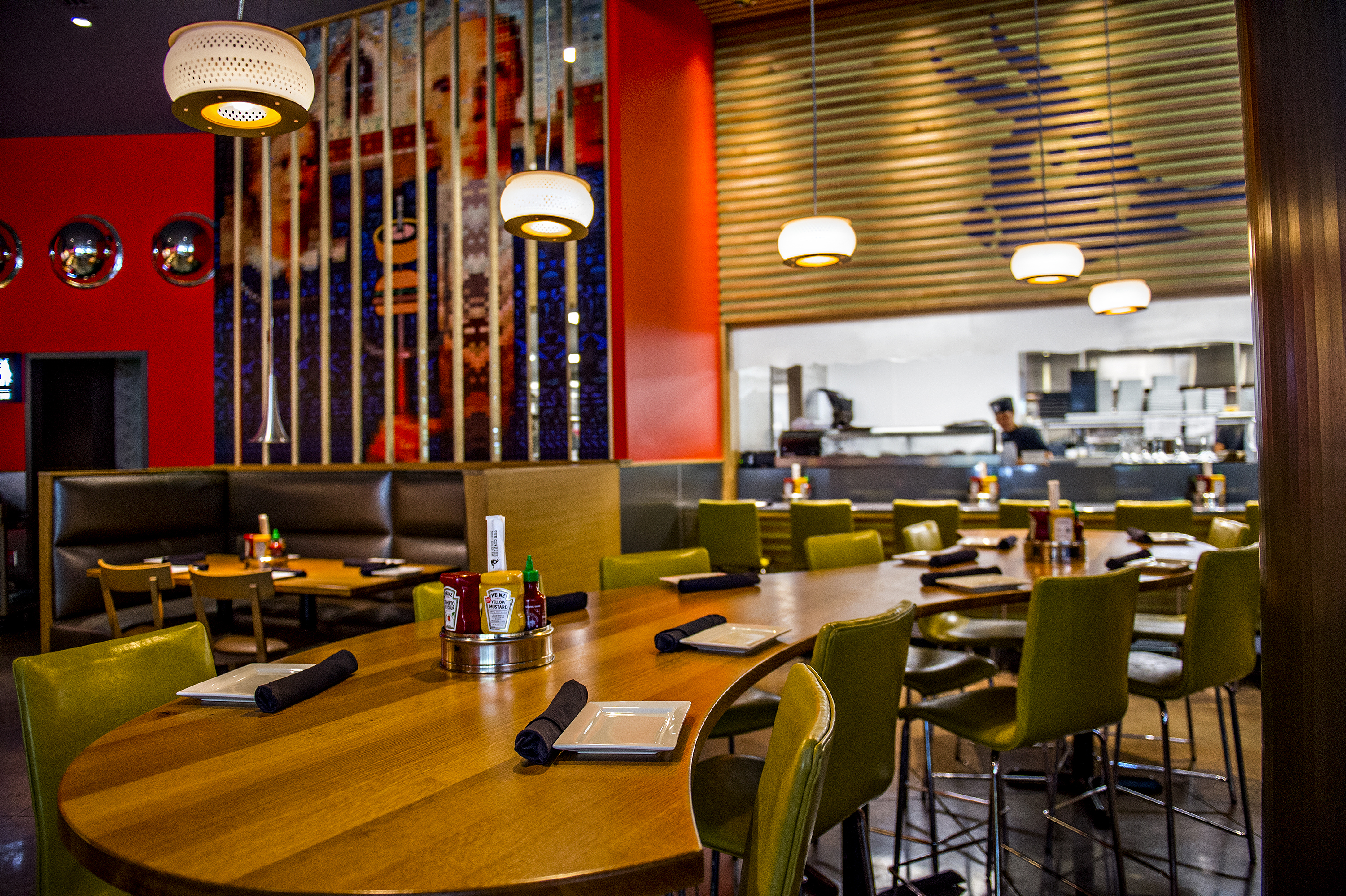
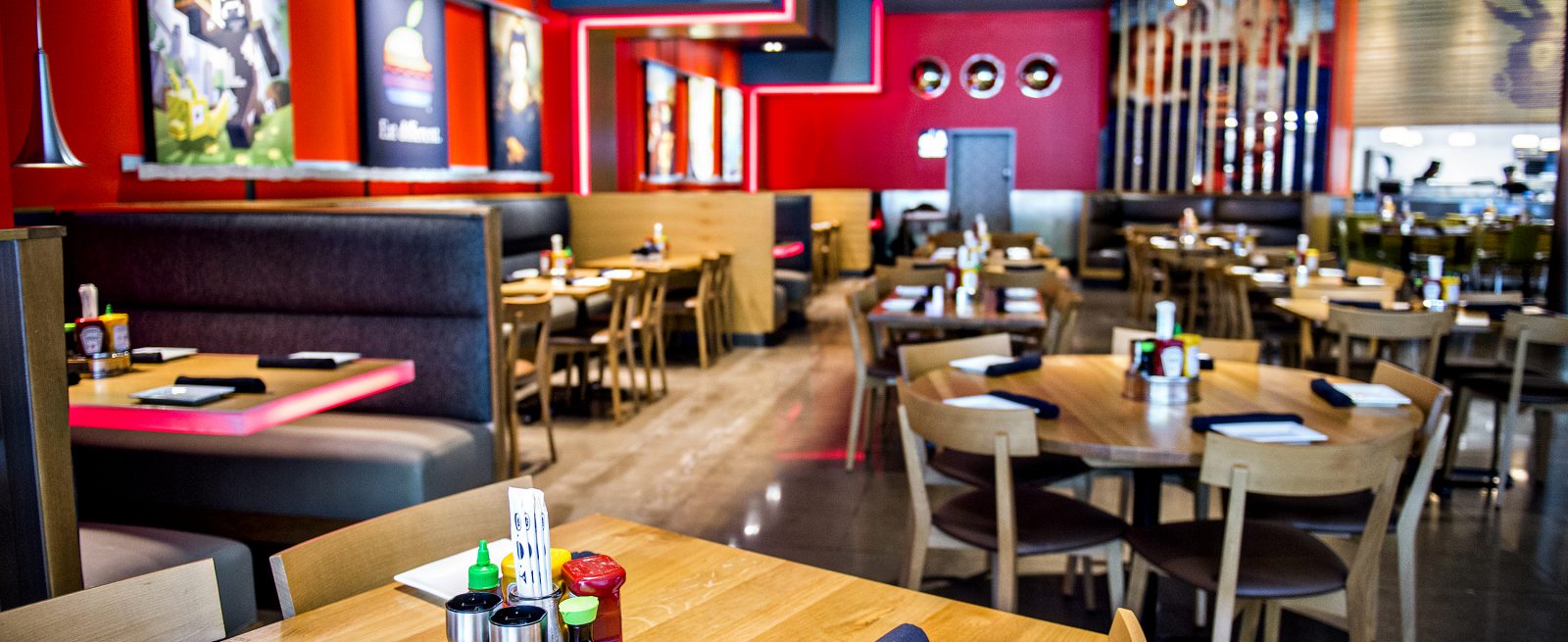
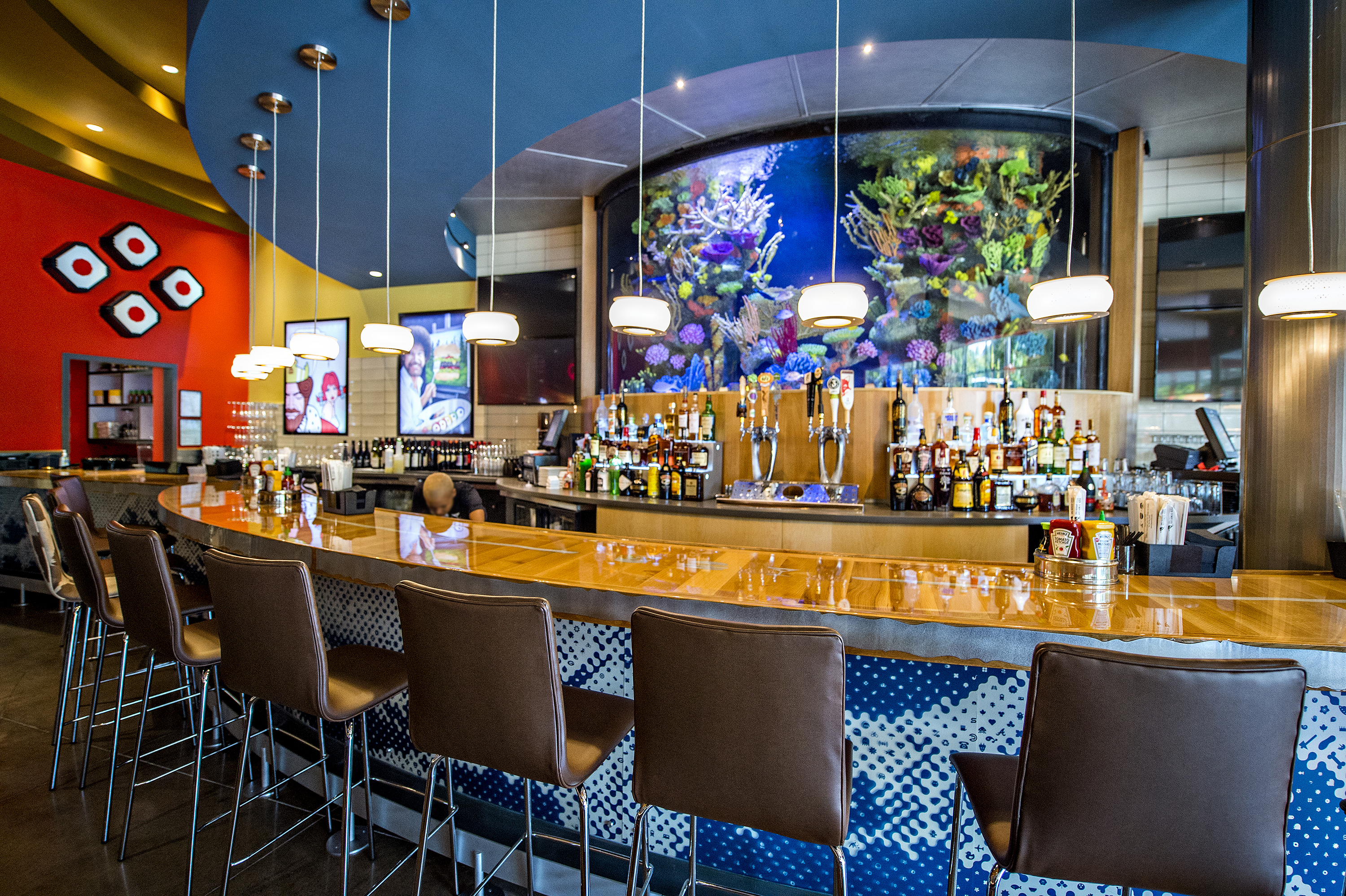
As the design firm responsible for bringing this vision to life, our primary goal was to clearly communicate The Cowfish’s brand differentiators and core values. Knowing that they focus on true quality, the guest experience and fostering “wow” moments – we set out to develop a design that exemplified those characteristics. The main dining room’s focus is an aquarium-worthy fish tank balanced by floating, edge lit, LED color-changing tables along the opposite wall. The tank became a focal point in the space, without being a dominant feature. The unique character of the custom artwork is highlighted and celebrated through its display in a gallery-like fashion. Additionally, we designed many of the art pieces to deliver unique experiences both up close and from a distance, like the abstracted wave pattern on the bar front that is made up of many small individual icons.
With the entire restaurant being open, we were looking to highlight the potential for guests to have multiple experiences in the same space. We wanted to ensure that customers could visit the restaurant over and over, and each time it would feel different. Elevating the bar’s presence was important, since it doesn’t stand as a main element in their other stores. We designed illuminated liquor risers to showcase their specials, while frosted taps distinguish beer as a focal point. The sloped, curving ceiling mimics an abstract ripple in water and creates a defined, unique space. The bar top has brushed aluminum Cowfish logos embedded into the planks of wood, all encircling the 16-foot-wide live fish tank. Additionally, we elevated the importance of the sushi bar by giving it a home of its own in the middle of the space. The food theater from the interaction with the sushi chef adds life and character to the space.
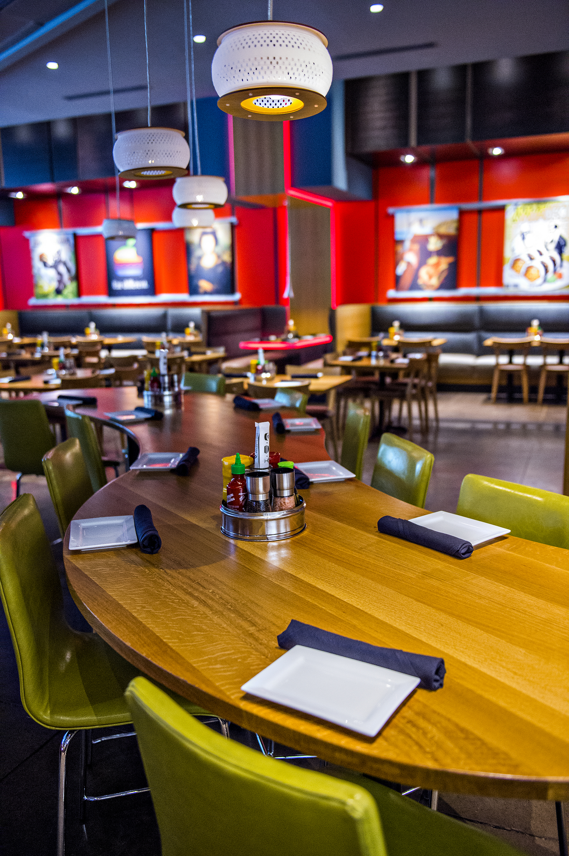
One of our main goals was to create a non-themed space that would have longevity and remain relevant. We wanted to uphold the Cowfish’s irreverence as a brand and culture through an interactive and playful space. Surprises are everywhere. At the hostess stand a small tank greets guests with their muse: an actual cowfish! Life was brought back to their existing artwork by converting them into functional environmental graphics. We essentially turned the art into architecture. The American Gothic image, which is made up of many small icons, was printed on a slat wall that now helps to divide the spaces. The ceiling in the main dining area represent the tectonic plates of the earth, contrasting land and sea when mirrored next to the water-like ceiling above the bar. We found that this was an efficient way to use simple materials in a creative manner to tell a distinct story. Larger-than-life bento boxes in the to-go area exhibit unique brand-specific art made entirely out of Legos. We truly aimed to provide new dining experiences through these hidden gems – even when customers are simply getting take-out.
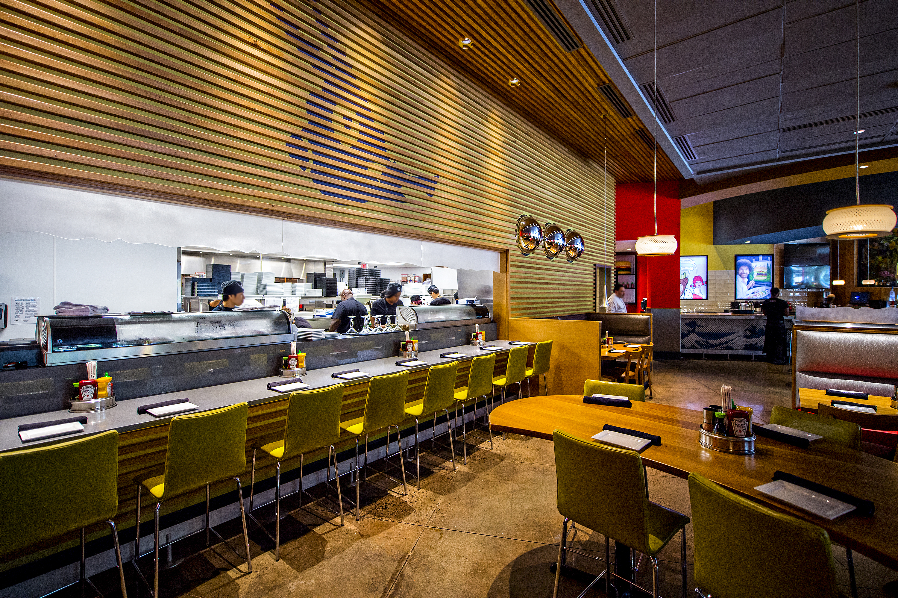
From an operational efficiency standpoint, we were able to integrate two completely different kitchens for burgers and sushi into one space. The kitchen fosters an elevated level of food and service, while enabling servers to work more efficiently.
Since this was a second generation space, we had to pay close attention to customers’ predisposition to the room. The previous tenant had operated under a similar name and somewhat comparable menu, so it was important to create a restaurant both unique to the area and noticeably different from the last concept. Therefore, we completely removed the exterior façade and gutted the interiors. The new exterior geometries function as a funnel that invites guests inside. We increased the patio area and the number of windows so the passersby can actively witness the contagious energy. This liveliness, paired with vibrant contrasting colors, exemplifies a brand that is open to having fun and taking chances. The new Atlanta flagship restaurant is both dynamic and invigorating – and guests are as excited about the space as they are about the food.
